
Please help me with my academic writing task 1.
You please help me correct my academic task 1 response which is so hard for me.
I am trying to break down every task 1 essay into single sentences in order to limit each of my essays to around 150 to 170 words because mine often far exceed the word restriction of 150 words. This often wastes my time, causes more errors, and sometimes leads ideas to be off-topic.
Here's the question:
Here's my response:
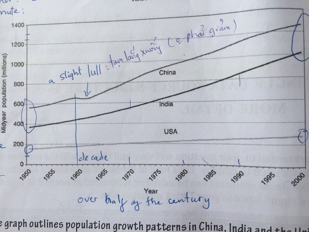
The line graph illustrates the population growth (in millions) in the United States, India and China over the second half of the 20th century from 1950 to 2000. Overall, although there was a rising trend in the three nations’ population, India and China showed much sharper increases than America did.
In detail, China and India’s population figures started at under 600 millions and below 400 millions respectively in 1950; after that, there were rapid swells to 1.25 billions and 1 billion in turn despite a slight lull in China in the early 1960s. American figures began at 150 millions in 1950 and ended at 250 millions in 2000, which was relatively modest compared to the two others.
The fact was drawn from the chart that the American population growth was much more gradual than the Indian and the Chinese. It can be calculated that an increase of 10 million people per decade in America was ten times less than the growing rates in the other two. Also, these upward trends were predicted to continue in the foreseeable future.
Top answer
The line graph illustrates (wrong verb for a line graph. ) plots / compares / shows the population growth (in millions) in the United States, India and China over the second half of the 20 th century from 1950 to 2000 . (Redundant.
- The line graph illustrates (wrong verb for a line graph.
- ) plots / compares / shows the population growth (in millions) in the United States, India and China over the second half of the 20 th century from 1950 to 2000 .
- (Redundant.
- It repeats exactly the same thing.
- ) (Here you change the main subject of the paragraph.
Get the Weekly English Kit 📬
New words, one handy idiom, and a 2-minute quiz — delivered to your inbox to keep your streak alive.
The line graph illustrates (wrong verb for a line graph. Use "illustrate" for diagrams and pictures.) plots / compares / shows the population growth (in millions) in the United States, India and China over the second half of the 20th century from 1950 to 2000. (R
 Related Questions