
Please help me with Ielts writing task 1
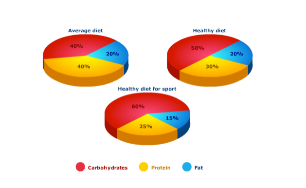
The pie charts compare the percentage of carbohydrates, protein and fat in three types of diet that people often have.
It is evident that carbohydrates is the greater part in three charts, with a significantly higher proportion of carbohydrates in a healthy sport diet than in an average diet or a healthy diet.
Sport people require a diet comprising 60% carbohydrates, which is 20% and 10% more numerous than these figures for a healthy diet and an average diet respectively. On the other hand, people who eat an average diet have to consume food with the ratio of 40% protein to their totally proper nutrition. However, if they ate 2 other diets, the would consume less protein.
The third compound shown in the charts is fat. This is the least pattern, being responsible for exactly one fifth of the average diet and the healthy diet similarly, but the figure drops to only 15% for the healthy sport diet.
Thank you so much!
Top answer
Essays should not be posted in our Grammar forum. They belong in our Essay Writing forum.
- Essays should not be posted in our Grammar forum.
- They belong in our Essay Writing forum.
Get the Weekly English Kit 📬
New words, one handy idiom, and a 2-minute quiz — delivered to your inbox to keep your streak alive.
Essays should not be posted in our Grammar forum. They belong in our Essay Writing forum.
The pie charts compare the percentage of carbohydrates, protein and fat in three types of diet that people often have.
It is evident that cCarbohydrates is the greater part in three charts, (Better: What is striking about the three diets is that carbohydrates represent the largest proportion in every diet,) with a significantly higher proportion of carbohydrates i
 Related Questions