
Please help me with ielts writing task 1
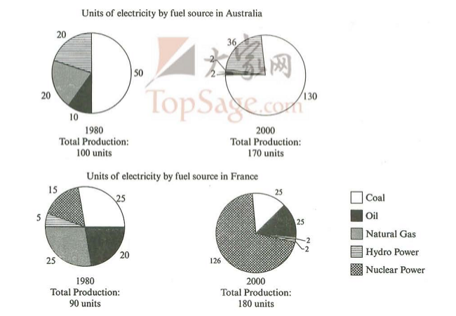
The pie charts reveal the amount of electricity produced be five kinds of fuel sources in Australia and France at two different times 1980 and 2000.
It is noticeable that the total units of electricity increased dramatically during the period of 36 years. Besides that, there were big dissimilarities for both nations.
Coal was used to produce 50 of the whole 100 units of electricity in Australia, before rising to 130 out of 170 units by 2000. By contrast, nuclear power became the most numerous sources of fuel in France at the end of the period, creating almost 75% the national electricity.
Australian made electricity from hydro power with the approximate percentages in both times, but the amount of electricity produced by using this kind of power decreased from 5 to only 2 units in the other nation. However, oil remained a relatively important fuel source in France, but its usage declined in Australia. In addition, two countries relied on natural gas for electricity production significantly lower in 2000 than in the year 1980.
Thank you so much!
Top answer
Here are my suggestions: The pie charts reveal the amount of electricity produced be by five [kinds of] fuel sources in Australia and France at two different times in 1980 and 2000. It is noticeable that the total units of electricity increased dramatically during the period of 36 years. Besides that , However [OR: On the other hand ] there were big dissimilarities for both between these nations.
- Here are my suggestions: The pie charts reveal the amount of electricity produced be by five [kinds of] fuel sources in Australia and France at two different times in 1980 and 2000.
- It is noticeable that the total units of electricity increased dramatically during the period of 36 years.
- Besides that , However [OR: On the other hand ] there were big dissimilarities for both between these nations.
- [ "Besides" is used for additional facts; "However" is used for exceptions or contradictions] In 1980, [ give the dates ] c oal was used to produce 50 of the whole 100 units of electricity in Australia, before increasing rising to 130 out of 170 units by 2000.
- By contrast, in France, nuclear power, which supplied only one-sixth of the power used in 1980 , became the most numerous greatest source s of fuel in France at by the end of the period, creating almost 75% of the national electricity.
Get the Weekly English Kit 📬
New words, one handy idiom, and a 2-minute quiz — delivered to your inbox to keep your streak alive.
Here are my suggestions:
The pie charts reveal the amount of electricity produced be by five [kinds of] fuel sources in Australia and France at two different times in 1980 and 2000.
It is noticeable that the total units of electricity increased dramatically during the period of 36 years. Besides that, However [OR: On t
 Related Questions