
Please help me to review this Task 1 essay!
The bar chart shows the average price of a house in the UK in different years. The pie chart shows the percentage between owners, people renting and those with second homes.
Summarise the information by selecting and reporting the main features, and make comparation where relevant.
The bar chart illustrates the cost of housing in the UK in average in five years, started from 1980 and ended in 2005 while the pie charts compare the proportion in three different housing categories.
Overall, the money spending on accommodation in the UK gradually increased and reached the peak in 2005. Moreover, the percentage of renting houses was the highest one from 1985 to 2995 when in 2005 those who owned houses proliferated and went on the top.
In detail, from 1980 to 1985, the average price of house accounted for less than 50,000 pounds. From then, the net money of housing increased and made up the highest amount of money in 2005, which was approximately 200,000 pounds, more than four times as the lowest one took.
Moving to the pie charts, more than half of percentage in various housing parts was made up by the owners, which took two third of the proportion in 1985. However, there was a changing statistics in 2005 when owner was the highest part of three related features which accounted for 53%.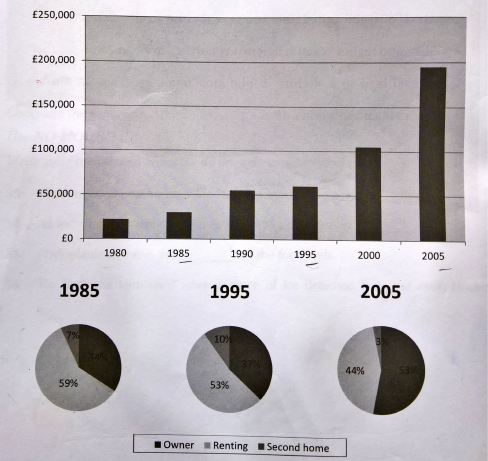
Top answer
The bar chart illustrates (wrong word - illustrate means to make a picture. ) the cost of housing in the UK in on average in five years , (wrong expression) started (wrong verb form) from 1980 and ended (wrong verb form) in 2005 . The while the pie charts compare the proportion in three different housing categories.
- The bar chart illustrates (wrong word - illustrate means to make a picture.
- ) the cost of housing in the UK in on average in five years , (wrong expression) started (wrong verb form) from 1980 and ended (wrong verb form) in 2005 .
- The while the pie charts compare the proportion in three different housing categories.
- (That is not good.
- What do the pie charts show?
Get the Weekly English Kit 📬
New words, one handy idiom, and a 2-minute quiz — delivered to your inbox to keep your streak alive.
The bar chart illustrates (wrong word - illustrate means to make a picture. ) the cost of housing in the UK in on average in five years, (wrong expression)
 Related Questions