
Please help me to check my writing IELTS task 1
The chart and graph below give information about sales and share prices for Coca-Cola.
Write a report for a university lecturer describing the information shown below.
Answer:
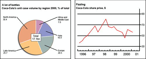
The chart and graph show the number of Coca-Cola's unit in 2000 and its share price from 1996 to 2001, respectively.
It can be seen from the pie chart that North America utilized the most Coca-Cola product with 30.4%, followed by Latin America with 25.7%. This is because the Coca-Cola was originally introduced in North America. Europe and Asia consumed 20.5% and 16.4% in total Coca-Cola production, respectively, while the Coca-Cola distribution in Africa was small with only 7%.
Regarding the share price, the year of 1996 showed the lowest share price of about $36. It increased twice in the middle but grew down to about $55 in the end of 1997. The share price reached the peak of $80 in the second quarter of 1998 and then gradually decreased to approximately $45 in 2000.
In conclusion, although the share price was not stable, a huge number of Coca-Cola's unit is sold in over the world every year. It is also indicated that drinking Coca-Cola seems becoming a culture in America region.
Top answer
The chart and graph show the number of respectively illustrate Coca-Cola's sales (in terms of volume) unit in 2000 and its share price from 1996 to 200 1. , respectively. 7%.
- The chart and graph show the number of respectively illustrate Coca-Cola's sales (in terms of volume) unit in 2000 and its share price from 1996 to 200 1.
- , respectively.
- 7%.
- This is perhaps because the Coca-Cola was originally introduced in North America.
- 4% in of the total respectively .
Get the Weekly English Kit 📬
New words, one handy idiom, and a 2-minute quiz — delivered to your inbox to keep your streak alive.
The chart and graph show the number of respectively illustrate Coca-Cola's sales (in terms of volume) unit in 2000 and its share price from 1996 to 2001.
 Related Questions