
Please help me to check my IELTS Wrting Task 1. Thank you all.
The given pie charts indicated the proportion of food expenditure on the average family spent on different meals in different years. The line graph illustrated the number of meals eaten in two different types of restaurants: Fast Food and Sit down.
We can see from the pie graphs that the expense people spent on restaurant rose gradually over the researched period. As shown by the fact that eating in restaurant won 10% in 1970 and in 2000 the percentage was at five times in 1970 (50%).
According to the line graph, sit down restaurant and fast food meals were at the same starting point – 20 thousand meals in 1970. However, people preferred eating sit-down to having fast food in 1980, as presented the numbers sit down restaurant meals was higher than fast food meals. There was a sharp fluctuation during the period from 1980 to 2000. The number of fast food meals increased considerably from 30 thousand to approximately 85 thousand higher than sit down meals, which accounted for nearly 60 thousand in 2000.
Overall, the upward trend in eating fast food within 30 years has shown that people eating habit changed towards becoming flexible and convenient.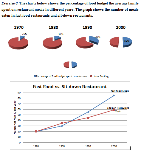
Top answer
Pay attention to the mathematical reasonableness of what you are saying. The given pie charts indicated (wrong tense. Use present tense.
- Pay attention to the mathematical reasonableness of what you are saying.
- The given pie charts indicated (wrong tense.
- Use present tense.
- ) the proportion of food expenditure on the (incorrect usage) average family spent on different meals in different years .
- (How many years?
Get the Weekly English Kit 📬
New words, one handy idiom, and a 2-minute quiz — delivered to your inbox to keep your streak alive.
Pay attention to the mathematical reasonableness of what you are saying.
The given pie charts indicated (wrong tense. Use present tense. ) the proportion of food expenditure on the (incorrect usage) average family spent on different meals in different years.
 Related Questions