
Please help me - Task 1 - Exportation from Australia
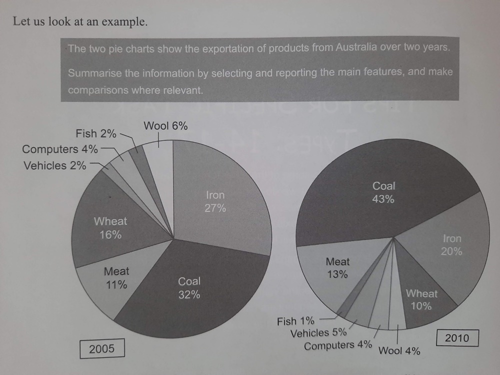
What follows are the comparisons of how much each product accounted for of the total exportation from Australia in the years 2005 and 2010.
Overall, coal and iron were the most exported products in both surveyed years, although their proportions notably changed. Also noticeable is that the percentages of all the other products, except for meat and wheat, were substantially low.
Looking closer at the graphs, coal and iron have the highest percentages, 32% and 27% respectively, in 2005. This remained true in the fifth following year, but their proportions had gone in different directions. By 2010, coal remarkably increased to 43% whereas iron experienced a 7% drop.
Meat and wheat saw the same patterns as those previously mentioned products. While wheat’s percentage had considerably slipped, from 16% to only 10%, meat only gained a tiny 2% over 5 years, ending up at 13% of the total exportation in 2010. As for the other products, their proportions remained the lowest and almost stayed the same in both years.
Top answer
[ 1] What follows are the comparisons of how much each product accounted for of the total exportation The two pie charts compare six commodities in terms of their proportion of total exports from Australia in the years 2005 and 2010. Overall, coal and iron were the most exported products represented the largest sectors in both charts, surveyed years, although coal became even more dominant in the latter year. their proportions notably changed.
- [ 1] What follows are the comparisons of how much each product accounted for of the total exportation The two pie charts compare six commodities in terms of their proportion of total exports from Australia in the years 2005 and 2010.
- Overall, coal and iron were the most exported products represented the largest sectors in both charts, surveyed years, although coal became even more dominant in the latter year.
- their proportions notably changed.
- Also noticeable is that the percentages of all the other products, except for meat and wheat, were minimal.
- substantially low.
Get the Weekly English Kit 📬
New words, one handy idiom, and a 2-minute quiz — delivered to your inbox to keep your streak alive.
[ 1] What follows are the comparisons of how much each product accounted for of the total exportation The two pie charts compare six commodities in terms of their proportion of total exports from Australia in the years 2005 and 2010.
Overall, coal and iron were the most exported products
 Related Questions