
Please help me: Task 1
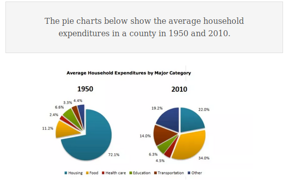
The two pie charts depict the spending of the average household on six major categories in a county in terms of percentage in the years 2000 and 2016
Overall, at the beginning of the period, the average household spent the least in healthcare, while housing was the most significant household expenditure. At the end of the period, food became the largest expenditure, and the lowest spending was from healthcare.
Food accounted for 11.2% of household spending in 1950 and experienced a more than threefold increase to about one-third in 2010. Health care was 2.4% in 1950 and had a growth of 2.1% in 2010. At the beginning of the period, transportation and other categories made up 3.3% and 4.4% respectively, and these figures rose significantly to 14% and 19.2% in 2016.
Housing, which comprised almost three quarters of household spending in 1950, fell dramatically to 22% in 2010. In contrast, the spending on education barely changed in both years from 6.6% to 6.3%.
Top answer
The two pie charts depict the spending of the average household on six major household budget categories in a county (the categories are not in the country. You need to be more careful in placing phrases. If the sentence gets too unwieldy, write two sentences.
- The two pie charts depict the spending of the average household on six major household budget categories in a county (the categories are not in the country.
- You need to be more careful in placing phrases.
- If the sentence gets too unwieldy, write two sentences.
- ) in terms of percentage (All pie charts show percentages / proportions.
- It is the very nature of a pie chart.
Get the Weekly English Kit 📬
New words, one handy idiom, and a 2-minute quiz — delivered to your inbox to keep your streak alive.
The two pie charts depict the spending of the average household on six major household budget categories in a county (the categories are not in the country. You need to be more careful in placing phrases. If the sentence gets too unwieldy, write two sentences. ) in terms of percentage (All pie charts show percentages
 Related Questions