
Please help me: Task 1
Special thanks to AlpheccaStars. May God bless you more.
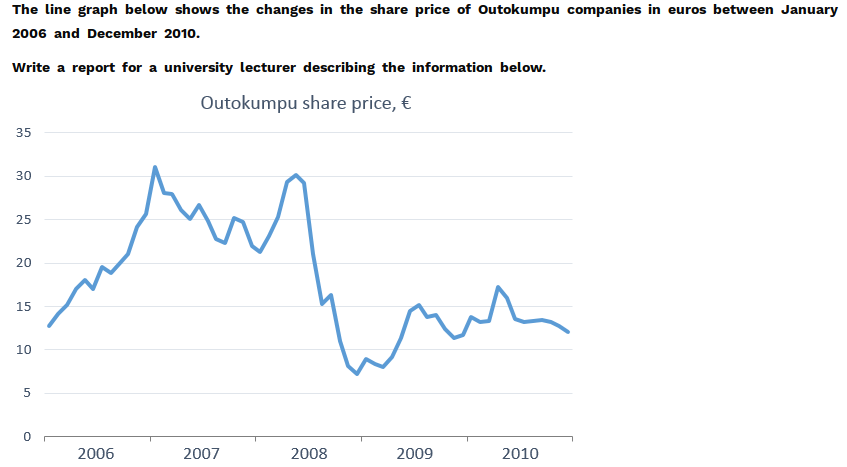
The line graph illustrates the alterations in the price of of Outokumpu companies in the stock market over a period of 5 years from January 2006 to December 2010.
Overall, it can be seen that Outokumpu comapanies' share price fluctuated widely throughout the time frame shown with some peaks and troughs.
At the beginning of 2006, the share price of these companies stood at around 12 euros per share. From this point, it dramatically increased and peaked to over 30 euros in January of 2007. After that, it dropped by roughly 1 euro by the end of 2007 but recovered and jumped to its second highest level of 30 euros in mid-2008.
The next 6 months showed that Outokumpu suffered a slump and their share price fell significantly, reaching it lowest level of 7 euros near the end of 2008. In the final 2 years, the share price oscillated between 7 and 11 euros, approximately 10 per cent lower than its original price.
Top answer
The line graph illustrates (wrong word. shows/plots/gives) the alterations in (wrong word ) the price of of Outokumpu companies in the stock market over a period of 5 years from January 2006 to December 2010. Overall, it can be seen that (unnecessary verbiage) Outokumpu comapanies ' share price fluctuated widely throughout the time frame shown with some peaks and troughs.
- The line graph illustrates (wrong word.
- shows/plots/gives) the alterations in (wrong word ) the price of of Outokumpu companies in the stock market over a period of 5 years from January 2006 to December 2010.
- Overall, it can be seen that (unnecessary verbiage) Outokumpu comapanies ' share price fluctuated widely throughout the time frame shown with some peaks and troughs.
- At the beginning of 2006, the share price of these companies stood at around 12 euros per share.
- From this point, it more than doubled dramatically increased and peaked at to over 30 about 31 euros in January of 2007.
Get the Weekly English Kit 📬
New words, one handy idiom, and a 2-minute quiz — delivered to your inbox to keep your streak alive.
The line graph illustrates (wrong word. shows/plots/gives) the alterations in (wrong word ) the price of of Outokumpu companies in the stock market over a period of 5 years from January 2006 to
 Related Questions