
Please help me review my task 1. Thank you so much
The chart gives information about the proportion of students choosing different science subjects in a university in 1992 and 2012.
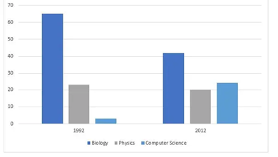
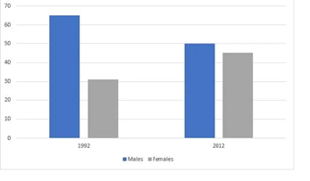
The first bar chart plots the gender distribution in enrolment of science disciplines while the accompanying bar chart compares the proportion of undergraduates choosing three specified subjects, namely biology, physics, and computer science in two years 1992,2012
In general, the gender gap when it comes to studying science subjects narrowed sharply over the years. Additionally, there was a decrease in the percentage of biology and physics students. However, it was not the case for computer sciences.
In 1992, more than three-fifths of male attended science classes, which was twofold as much as that of their opposite peer-groups. Nevertheless, in next ten years, there was not much difference in both, as the latter had a further 10% increase while a notable decrease of 12% for the former. In 1992, biology was by far the most common science subject across all disciplines, accounting for 62%, nearly tripling the physics’ percentage (22%) compared to a modest 2% in computer science. The year 2012 showed more significant changes. The proportion of biology learners dropped dramatically to 42%, whereas physics students remained unchanged and computer science became more favored with its rising percentage to over 20%.
Top answer
Sorry, but the charts are too small and the text to too blurry to read. Please attach a better image.
- Sorry, but the charts are too small and the text to too blurry to read.
- Please attach a better image.
Get the Weekly English Kit 📬
New words, one handy idiom, and a 2-minute quiz — delivered to your inbox to keep your streak alive.
Sorry, but the charts are too small and the text to too blurry to read. Please attach a better image.
desk slide 241The first bar chart plots the gender distribution in enrolment of science disciplines
The first bar chart compares the percentages of male and female students who elected to major in the sciences at one university in 1992 and 2012
desk slide 241accompanying bar chart compares the proportion of undergraduates choosin
Topic:
The charts show the percentage of male and female students choosing science subjects in one university in 1992 and 2012 and the three most popular science subjects which they studied.
The first bar chart plots the gender distribution in enrolment of science disciplines (not a good d
 Related Questions