
Please help me review my IELTS Writing task 1. Thank you very much.
The graph below shows how money was spent on different forms of entertainment over a five year period.
Summarize the information by selecting and reporting the main features, and make comparisons where relevant.
The chart shows how money was used for various entertainment purposes in the given years.
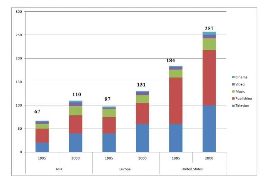
Generally, the amount of money used in Asia was the lowest whereas that of the United States was the highest in both years. The figures of money paid on cinema and video were the lowest in both years for all three countries.
In Asia, the money paid on television always remained lower than that of publishing, about 25 and nearly 48 in 1995 and 2000, respectively.
In European countries and America, this trend was no longer applicable, which means the television field received a little bit higher amount of money than the publishing one. The gap between these two figures was hardly seen in Europe since it was only approximately 3 in either years while in the US, the gap accounted for about 50 in the year 1995 and just more than 25 in the year 2000.
Top answer
The chart (What kind of chart? There are many kinds of charts. - pie chart, Gantt chart, eye chart, or flow chart) shows how money was used (That is not correct.
- The chart (What kind of chart?
- There are many kinds of charts.
- - pie chart, Gantt chart, eye chart, or flow chart) shows how money was used (That is not correct.
- ) for various entertainment purposes in the given years.
- (What years?
Get the Weekly English Kit 📬
New words, one handy idiom, and a 2-minute quiz — delivered to your inbox to keep your streak alive.
The chart (What kind of chart? There are many kinds of charts. - pie chart, Gantt chart, eye chart, or flow chart) shows how money was used (That is not correct. What is plotted?) for various entertainment purposes in the given years. (What years? How many years? Your first paragraph
Example essay:
The stacked bar chart compares three world regions (Asia, Europe and the US) in terms of their expenditures on entertainment in two years, 1995 and 2000. The stacks are divided into five categories of entertainment: cinema, video, music, publishing and television. Units of measure are billions of dollars.
Overall, each region spent more in 2000
 Related Questions