
Please, help me review my bar chart description
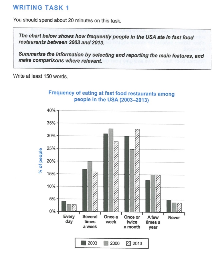
The bar chart gives information about the fast food eating habits of Americans in 2003, 2006, and 2013.
Overall, most Americans ate in fast food restaurants once a week or once or twice a month, and the least common habit was to eat there every day. All habits, except visiting restaurants once or twice a month and a few times a year, became less common.
From 2003 to 2006, the proportions of Americans visiting restaurants once a week, several times a week, and a few times a year increased slightly from about 31 to 33%, 17 to 20%, and 13 to 15%, respectively. While the proportion eating once a week remained stable at 15% in 2013, the percentage eating once a week decreased considerably to around 28%.
The shares of Americans going to restaurants every day and not going at all both stayed at below 5% in 2013 after declining marginally between 2003 and 2006. The percentage going once or twice a month also fell initially, but it fell significantly and then grew massively to well above 30%, becoming the highest.
Top answer
) gives information about (vague) the fast food eating habits of Americans in 2003, 2006, and 2013. (This is not a good opening paragraph. ) Overall, most Americans ate in fast food restaurants once a week or once or twice a month, and the least common habit was to eat there every day.
- ) gives information about (vague) the fast food eating habits of Americans in 2003, 2006, and 2013.
- (This is not a good opening paragraph.
- ) Overall, most Americans ate in fast food restaurants once a week or once or twice a month, and the least common habit was to eat there every day.
- All habits, except visiting restaurants once or twice a month and a few times a year, became less common.
- ) From 2003 to 2006, the proportions of Americans visiting restaurants once a week, several times a week, and a few times a year increased slightly from about 31 to 33%, 17 to 20%, and 13 to 15%, respectively.
Get the Weekly English Kit 📬
New words, one handy idiom, and a 2-minute quiz — delivered to your inbox to keep your streak alive.
The bar chart (You need to identify what type of chart this is.) gives information about (vague) the fast food eating habits of Americans in 2003, 2006, and 2013. (This is not a good opening paragraph. It does not tell us the units of measure, what the categories are or much else.)
Overall, most Americans ate in fa
You should recognize this type of plot immediately as a frequency distribution chart, and the curves as bell curves.
There is a special vocabulary for this type of plot. Have you studied normal distributions? You didn't use the proper words for this essay.
Draw a curve for 2003 and 2013. Compare the curves.
 Related Questions