
Please help me in checking task 1 ielts
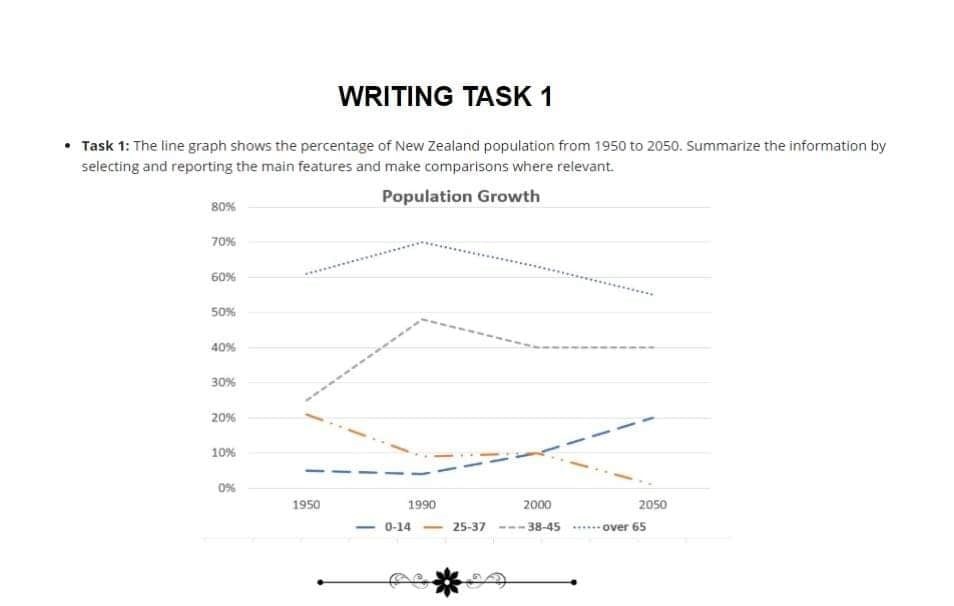
The line graph figures the variation of New Zealand population in proportion by different age groups between 1950 and 2050.
Overall, four age groups have had a major shift since the late 1990s. While there is a steady growth in the number of residents belonging to the youngest age group, the elder groups show a considerable decline during the same time.
In the beginning of the period, the age group of children and teenagers accounted for the lowest proportion by nearly 5% and experienced a minimal decrease until the 1990s. By the end of the 20th century, this group saw a gradual rise with nearly 15% after 60 years and then took third place compared to the others. The percentage of the adult group dipped to 10% before 1990, when it fluctuated around this level until the proportion was level with the youngest group in the 2000s, followed by a considerable decrease to zero percent in the new century.
Before the 1990s, the age group between 38 and 45 reached a peak by a double in percentage of growth. After that, it fell by nearly 10% in the next 10 years and then levelled off until the end of the period. The elder group experienced the same variation in the first 40 years when it significantly increased by 10% before dropping to 55% in the final year.
Top answer
This task is defective. Do not use such atrocities for your practice. Can you see the problem?
- This task is defective.
- Do not use such atrocities for your practice.
- Can you see the problem?
- danh197 The line graph figures the variation of New Zealand population in proportion by different age groups between 1950 and 2050.
- The highlighted words are not used correctly.
Get the Weekly English Kit 📬
New words, one handy idiom, and a 2-minute quiz — delivered to your inbox to keep your streak alive.
This task is defective. Do not use such atrocities for your practice. Can you see the problem?
danh197The line graph figures the variation of New Zealand population in proportion by different age groups between 1950 and 2050.
 Related Questions