
Please help me in checking multiple charts ielts
The chart below shows the amount of money per week spent on fast foods in Britain. The graph shows the trends in consumption of fast foods.
Summaries the information by selecting and reporting the main feature and make comparisons where relevant.
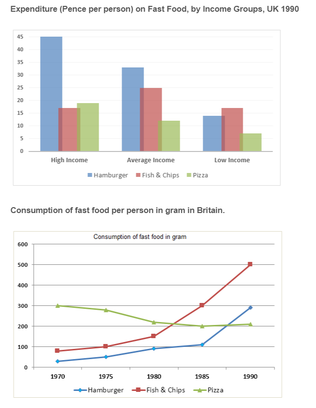
The chart displays the expenditure of the British on fast foods weekly. Meanwhile, the graph illustrates how the consumption varied within the time from 1970 to 1990.
Overall, hamburgers accounted for the major spending of British people on fast foods, especially for the high and mid income. Furthermore, Fish and chips illustrate a significant increase while pizza shows a downward trend during the period
With regard to the bar chart, people earning high income would choose to spend more on Hamburger with a twofold expenditure (43 pence/week) compared to the others (both under 20 pence) and the average income people still choose to buy hamburgers the most. However, they tend to spend more on fish and chips than the higher income group and this group was also the largest consumer group on this food. The remain group chose to spend the most on fish and chips, while pizza represented the lowest amount of spending with nearly one third of fish and chips spending.
Turning to the consumption trend, pizza was the largest consumption of the British with 300 grams/ week in the first year of the period and it gradually declined the following years to the lowest amount (200 grams/week) in the final year. On the other hand, both hamburger and Fish and Chips show an upward trend after 1975 and end up with 500 grams/week and 300 grams/week respectively in 1990.
Top answer
Your essay, nearly 240 words, is too long. This task is rather challenging to cover in 150 words.. The first paragraph is inadequate and imprecise.
- Your essay, nearly 240 words, is too long.
- This task is rather challenging to cover in 150 words..
- The first paragraph is inadequate and imprecise.
- What kind of chart?
- What kind of graph?
Get the Weekly English Kit 📬
New words, one handy idiom, and a 2-minute quiz — delivered to your inbox to keep your streak alive.
Your essay, nearly 240 words, is too long. This task is rather challenging to cover in 150 words..
The first paragraph is inadequate and imprecise. What kind of chart? What kind of graph? What are the categories?
Option #1
The clustered bar chart compares spending on three kinds of fast food (Hamburger, Pizza and Fish & Chips) by people in three income levels (high, ave
Overall, hamburgers accounted for the highest spending levels except for the low income group. major spending of British people on fast foods, especially for the high and mid income. Furthermore, Consumption of both Hamburger and Fish and chips illustrate a sig
 Related Questions