
Please help me fit. writing task 1
the pie chart provides a breakdown of reason why people choose go to work by bicycle or by car.
looking at the pie chart. It is immediately obivous that the percentage of people claimming that driving feel comfortable is highest , at 40%. By contrast , the figure for health and fitness is slightly lower, at 30% which is exactly the same as the quantity for the reason of less pollution. An other hand, the reason for driving more than cycling go to company because thay need to carry things to work and safer thang cycling at 14% and 11% respectively. 13 % of people cycle to work because it is cheaper than driving. besides, the amount of people say that driving to work is faster than cycling at 14%. this contrast with the cyclists who ride to work because it is faster than driving at 12 %. Meanwhile , the people don't worry about the parking problem when they go by bicycle but those who trave by car feel more comfortable journey over longer distance 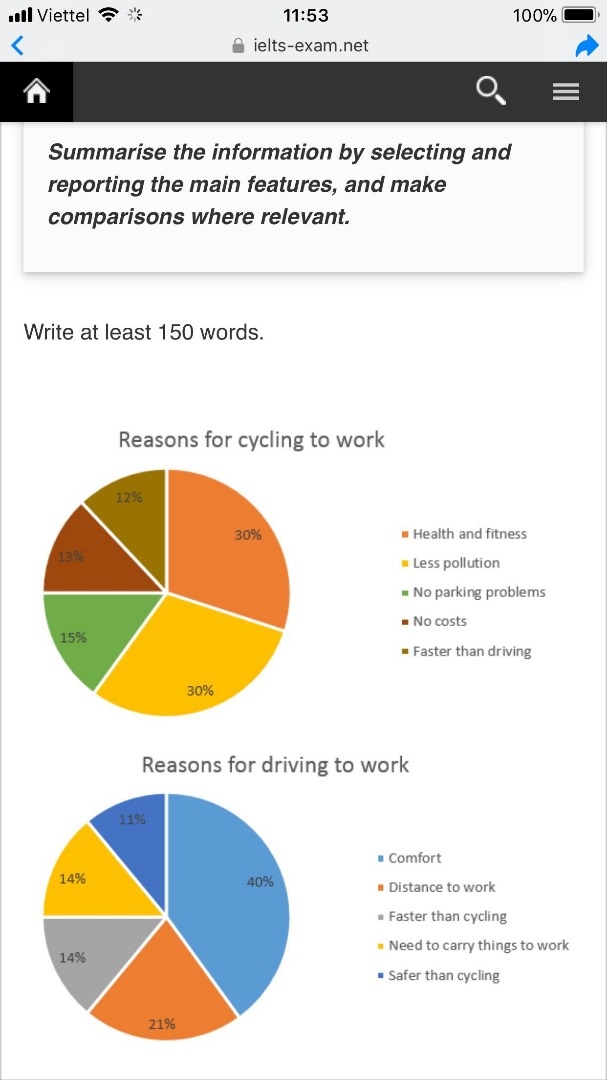
Top answer
) why people choose go to work by bicycle or by car. lo oking at the pie chart. (fragment, incomplete sentence) It is immediately obivous that the percentage of people claimming that driving feel (wrong form) comfortable is highes t , (spacing error) at 40%.
- ) why people choose go to work by bicycle or by car.
- lo oking at the pie chart.
- (fragment, incomplete sentence) It is immediately obivous that the percentage of people claimming that driving feel (wrong form) comfortable is highes t , (spacing error) at 40%.
- By contras t , (spacing error) the figure for health and fitness is slightly lower, at 30% which is exactly the same as the quantity for the reason of less pollution.
- An (missing word) other hand, the reason for driving more than cycling go to company (ungrammatical) because thay need to carry things to work and safer thang cycling at 14% and 11% respectively.
Get the Weekly English Kit 📬
New words, one handy idiom, and a 2-minute quiz — delivered to your inbox to keep your streak alive.
the pie chart (There is more than one...) provides a breakdown of reason (There is more than one...) why people choose go to work by bicycle or by car.
looking at the pie chart.
 Related Questions