
Please help me correct my writing task 1. Thank you so much.
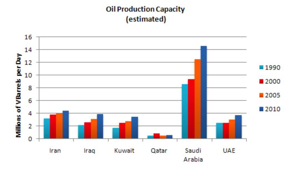
The bar chart shows the amount of oil produced in 6 different countries from 1990 to 2010, measured in millions of barrels per day.
In general, oil production in countries in the chart all experienced the trend of increasing throughout the period. Among 6 countries in the chart, Arab Saudi was the leading country in producing oil, whereas this figure for Qatar was the lowest.
During this 20-years period, there was a noteworthy rise in Arab Saudi. At the beginning of 1990, this country’s oil production capacity was just over 8 million barrels per day, this grew moderately and hit a peak of 14 million barrels per day at the end of this period, in 2010. On the contrary, the lowest country in terms of oil production capacity, Qatar, saw rare changes, relatively stable at less than 1 million barrels per day despite the insignificant rise in 2000.
There was also a slight increase in the other 4 countries in the chart. Despite the slow increase speed, this figure in Iran finally reached a peak of over 4 million barriers per day compared to other countries such as Iraq, Kuwait, and the UAE, at nearly 4 million barriers per day.
Top answer
I have highlighted the mistakes in your essay. It is a good try. Task 1 is quite challenging If you read my advice carefully in the links below, you may be able to fix most of these mistakes.
- I have highlighted the mistakes in your essay.
- It is a good try.
- Task 1 is quite challenging If you read my advice carefully in the links below, you may be able to fix most of these mistakes.
- For example, you did not use "peak" correctly.
- There is only one peak on this bar chart, and that is for Qatar in 2000.
Get the Weekly English Kit 📬
New words, one handy idiom, and a 2-minute quiz — delivered to your inbox to keep your streak alive.
I have highlighted the mistakes in your essay. It is a good try. Task 1 is quite challenging
If you read my advice carefully in the links below, you may be able to fix most of these mistakes.
For example, you did not use "peak" correctly. There is only one peak on this bar chart, and that is for Qatar in 2000. However, the word "peak" should only be used on line graphs which
 Related Questions