
Please help me correct my Ielts writing task 1 . Thank you very much.
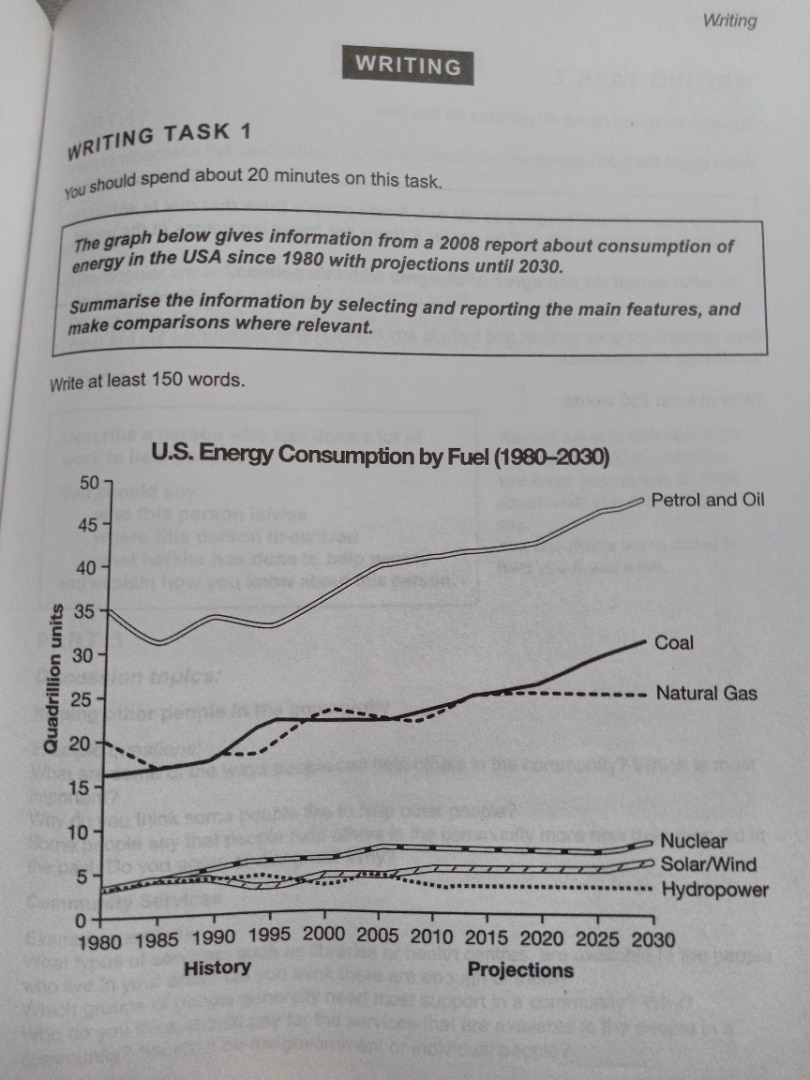
The graph shows the consumption of energy in the USA since 1980 with projection to 2030 in a 2008 report.
From the beginning, petrol and oil was in the first place with 35 quadrillion units, rose to 40 quadrillion units in 2005. From 2005 to 2020, petrol and oil increase steadily and project to reach to nearly 50 quadrillion units at the end of the period.
Coal and natural gas shared the similar trend. Coal begin with 15 quadrillion units while naturalgas is higher 5 quadrillion units. From 1985 to 1990, they are equal. After 50-year-period, coal has risen to nearly 30 quadrillion units, higher than natural gas 5 quadrillion units.
At the lowest part of the graph are nuclear, solar/ wind, and hydropower with only 4 quadrillion units. In 2010, hydropower failed a little while others have a slight increase. In 2030, hydropower fallen back to 1980 figure, moreover, nuclear, solar/ wind project to rise to about 10 quadrillion units.
Overall, USA will continue to rely on fusil fuels with sustainable, while the others remain relatively insignificant
Top answer
You are the third student to submit this task in the past few days. Do you all belong to the same class?
- You are the third student to submit this task in the past few days.
- Do you all belong to the same class?
Get the Weekly English Kit 📬
New words, one handy idiom, and a 2-minute quiz — delivered to your inbox to keep your streak alive.
You are the third student to submit this task in the past few days. Do you all belong to the same class?
I don't think you have read my advice. Maybe you didn't understand it.
Please read my advice for Task 1 essays:
The graph (what kind of graph?) shows the consumption of energy (that is not what is on the graph. Be specific. What is measured? How many categories are there? What are the categories. You did not read my advice. Your essay lacks coherence and cohesion. ) in the USA since 1980 with pro
 Related Questions