
0
Huynguyen158 Posted 10 years ago
Essay & Composition Writing
Please help me correct my IELTS writing
Hi teachers,
Could you please check and give me some advice to improve this writing? Thank you very much!
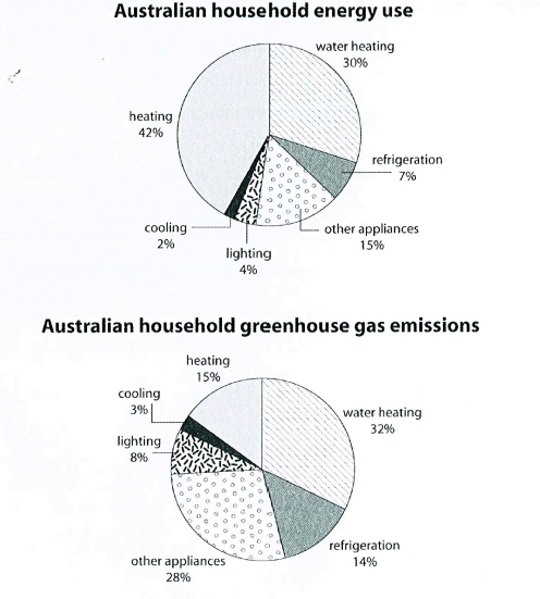
The first chart below shows how energy is used in an average Australian household. The second chart shows the greenhouse gas emissions which result from this energy use.
Summarise the information by selecting and reporting the main features, and make comparisons where relevant.
-----------------------------------------------------
The pie charts illustrate the purposes of energy’s consumption as well as the amount of greenhouse gas emitting in each usage in an Australian family.
Overall, both types of heating, on the whole, account for the highest percentage in consumption and emission. Also, cooling is the smallest proportion in such measurements.
Heating eats up its biggest share of energy use in Australian household, at 42%, while water heating is the second largest part of the whole, at 30%. By contrast, cooling makes up the smallest part, at 2%, which is half as much as lighting. Energy used for other appliances and refrigeration are 15% and 7%, respectively.
In terms of greenhouse gas emissions, water heating comprises the largest proportion, at 32%, higher compared to heating, which is 15%. On the other hand, only 3% of greenhouse gas emits from cooling, which makes it the smallest source of discharge. Meanwhile, emission from other appliances takes the second place, at 28%. The release of gas in lighting and refrigeration double the amounts of power consumed in such categories, which are 8% and 14%.
Could you please check and give me some advice to improve this writing? Thank you very much!
The first chart below shows how energy is used in an average Australian household. The second chart shows the greenhouse gas emissions which result from this energy use.
Summarise the information by selecting and reporting the main features, and make comparisons where relevant.
-----------------------------------------------------
The pie charts illustrate the purposes of energy’s consumption as well as the amount of greenhouse gas emitting in each usage in an Australian family.
Overall, both types of heating, on the whole, account for the highest percentage in consumption and emission. Also, cooling is the smallest proportion in such measurements.
Heating eats up its biggest share of energy use in Australian household, at 42%, while water heating is the second largest part of the whole, at 30%. By contrast, cooling makes up the smallest part, at 2%, which is half as much as lighting. Energy used for other appliances and refrigeration are 15% and 7%, respectively.
In terms of greenhouse gas emissions, water heating comprises the largest proportion, at 32%, higher compared to heating, which is 15%. On the other hand, only 3% of greenhouse gas emits from cooling, which makes it the smallest source of discharge. Meanwhile, emission from other appliances takes the second place, at 28%. The release of gas in lighting and refrigeration double the amounts of power consumed in such categories, which are 8% and 14%.
Top answer
The pie charts illustrate the purposes o f energy consumption how a typical Australian family uses energy as well as the amount percentage of greenhouse gas emissions emitting in each usage type accounts for. in an Australian family. Overall, B oth types of heating , on the whole, account for the highest two percentag es in consumption and emissio n, Also, whereas cooling is represents the smallest proportion in both charts.
- The pie charts illustrate the purposes o f energy consumption how a typical Australian family uses energy as well as the amount percentage of greenhouse gas emissions emitting in each usage type accounts for.
- in an Australian family.
- Overall, B oth types of heating , on the whole, account for the highest two percentag es in consumption and emissio n, Also, whereas cooling is represents the smallest proportion in both charts.
- in such measurements.
- Heating eats up its represents the biggest share of energy use in the average Australian household, at 42%, while water heating is the second larges t, part of the whole, at 30%.
Get the Weekly English Kit 📬
New words, one handy idiom, and a 2-minute quiz — delivered to your inbox to keep your streak alive.
3 Answers
0
The pie charts illustrate the purposes of energy consumption how a typical Australian family uses energy as well as the amount percentage of greenhouse gas emissions emitting in each usage type accounts for. in an Australian family.
Overall, Both types of heating , on the whole,
0
Thank you, teechr. Could you please help me out with some questions?
The pie charts illustrate how a typical Australian family uses energy as well as the corresponding perce
The pie charts illustrate how a typical Australian family uses energy as well as the percentage of greenhouse gas emissions in each usage type accounts for.Can I rewrite it as below?:
The pie charts illustrate how a typical Australian family uses energy as well as the corresponding perce
0
huynguyen158The pie charts illustrate how a typical Australian family uses energy as well as thecorrespondingpercentage of greenhouse gas emissionsincorresponding to each usage type.
huynguyen158Can I use compose/constitute/form instead of "account for" or "represent" in this context?"Const
 Related Questions