
Please help me correct my essay
The graph below shows the proportion of the population aged 65 and over between 1940 and 2040 in three different countries. Summarise the information by selecting and reporting the main features, and make comparisons where relevant.
The line graph compares the percentage of the population aged 65 and over from 1940 to 2040 in three different countries.
It is clear from the graph that there is a significant change in Japanese elderly population during the research period. Additionally, both Sweden and the USA undergo a huge increase in the number of individuals aged 65 and over.
In 1940, the proportion of Japanese elderlies was lowest, which is exactly 5%, while the figure for Sweden was higher, at around 7%. Meanwhile, USA experienced the highest rate of the population aged 65 and over which is roughly 10%. From 1960 to 1980, the percentage of both Swedish and American elderly people increase gradually. At the same time, the rate for Japan remained stable at about 3%.
In the period between 2020 and 2040, the rate of Japanese elderlies grows up dramatically from 7% to 27%, while the figure for Sweden drops a little from nearly 20% to 18% before rising to 25% in 2040. Meanwhile(Can I use "Concurrently" instead of "Meanwhile" in this sentence), the proportion of American old people rises slightly.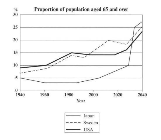
Top answer
Essays should be posted here in our Essay Writing forum.
- Essays should be posted here in our Essay Writing forum.
Get the Weekly English Kit 📬
New words, one handy idiom, and a 2-minute quiz — delivered to your inbox to keep your streak alive.
 Related Questions