
Please help me check the essay. Thank you so much
My topic: You should spend about 20 minutes on this task.
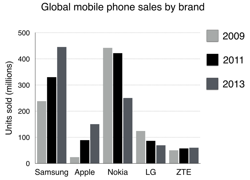
The chart below shows global sales of the top five mobile phone brands between 2009 and 2013.
Write a report for a university, lecturer describing the information shown below.
Summarise the information by selecting and reporting the main features and make comparisons where relevant.
You should write at least 150 words.
The bar chart compares five different brands, namely Samsung, Apple, Nokia, LG, and ZTE in terms of the number of mobile phones sold around the world during the period from 2009 to 2013.
Overall, there was a major and modest increase in Samsung, Apple, and ZTE sales of phones. However, it was not the case for Nokia, LG with their numbers decreasing significantly.
In 2009, Nokia was the most popular mobile brand among five categories, at 440 units, which was slightly twofold and fourfold higher than the Samsung and LG sales, at 230 units and 110 units respectively. The number of phones of ZTE and Apple was pale in comparison, ranging from 20 to 50.
However, Samsung sales dramatically rose to over 300 units in 2011 and overtook to peak at the highest point at 450 phones in 2013. Similarly, exactly 150 Apple phones were sold in 2013, which made it ranked the third position, while the number of ZTE phones still hovered around 60 phones, the lowest sales on a global scale. In contrast, a two-times drop to 250 units was characterized for Nokia sales, and only below 100 LG phones were sold globally by 2013.
Top answer
The bar chart compares five different brands, namely Samsung, Apple, Nokia, LG, and ZTE in terms of the number of mobile phones sold around the world for three years: 2009, 2011 and 2013. during the period from 2009 to 2013. (That is good for a line graph with continuous data.
- The bar chart compares five different brands, namely Samsung, Apple, Nokia, LG, and ZTE in terms of the number of mobile phones sold around the world for three years: 2009, 2011 and 2013.
- during the period from 2009 to 2013.
- (That is good for a line graph with continuous data.
- ) Overall, there was a major and modest (Those words are nearly opposite in meaning.
- It makes no sense.
Get the Weekly English Kit 📬
New words, one handy idiom, and a 2-minute quiz — delivered to your inbox to keep your streak alive.
The bar chart compares five different brands, namely Samsung, Apple, Nokia, LG, and ZTE in terms of the number of mobile phones sold around the world for three years: 2009, 2011 and 2013. during the period from 2009 to 2013.
(That is good for a line graph with continuous data. You have
 Related Questions