
PLEASE HELP ME CHECK TASK 1 IELTS. THANKS SO MUCH
The line graph shows the number of people who used different communication services in the world.
Units: per 100 inhabitants
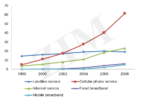
The chart illustrates how many people used five categories of service around the world over the course of 10 years starting in 1998.
Looking at the graph, it is immediately obvious that cellular phone service experienced an upward trend with this the exception of mobile broadband. And cellular phone service registered the highest figures.
In 1998, the figures for cellular phone and internet users started at around 5 per 100 inhabitants. They both increased over the remain years, with cell phone service gaining the higher position in 2008, at more than 60 users per 100 inhabitants. As you can see on the line chart, mobile and fixed broadband stood at 0 per 100 inhabitants. Around 10 years,the figures for these two service rose slightly from 0 to 5 per 100 inhabitants. Meanwhile, landline and internet service tended to go down in the year 2008.
Top answer
Here are my suggestions: The chart illustrates how many people used five categories of communication service s around the world over the course of 10 years starting in 1998. ] And cellular phone service registered the highest figures. [ Delete because you say this later .
- Here are my suggestions: The chart illustrates how many people used five categories of communication service s around the world over the course of 10 years starting in 1998.
- ] And cellular phone service registered the highest figures.
- [ Delete because you say this later .
- ] followed by internet service in second place.
- In 1998, the figures for cellular phone and internet users started at around 5 per 100 inhabitants.
Get the Weekly English Kit 📬
New words, one handy idiom, and a 2-minute quiz — delivered to your inbox to keep your streak alive.
Here are my suggestions:
The chart illustrates how many people used five categories of communication services around the world over the course of 10 years starting in 1998.
Looking at the graph, it is immediately obvious that cellular phone service experienced an the greatest upward trend with this the exception of mobile broadband
 Related Questions