
Please help me check my writing
Topic The graph below shows the amounts of waste produced by three companies over a period of 15 years.
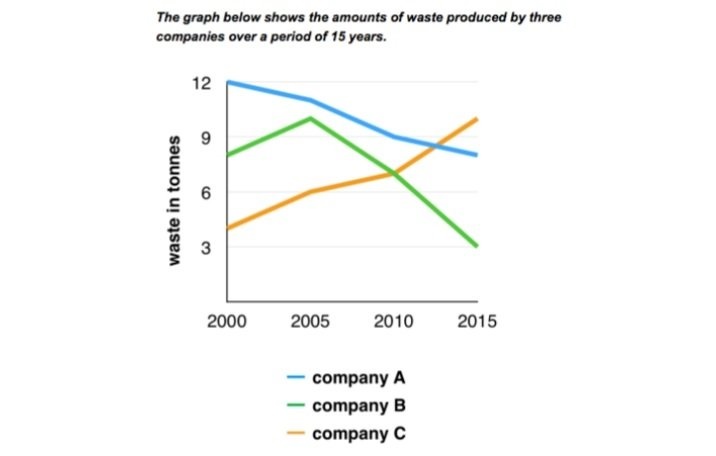
The line graph illustrates the amounts of waste output in tonnes by three different companies from 2000 to 2015.
As can be seen from the graph, there was similar downward trends in company A and B’s waste produced, while the amounts of waste output in company C witnessed a contrasting movement over the given period.
In the year 2000, the amounts of waste material of company A started at 12 tonnes, whereas the amount of waste was produced in company B and C begun at 8 and 4 tonnes. Over the subsequent five years, the figure for waste output of company A declined slightly to 11 tonnes, while there was a considerable climb in the amount of waste produced of company B and C, to 10 and 6 tonnes.
In addition, between 2005 and 2015 saw an enormous decrease in the figure for waste produced in company A and company B, to roughly 8 and 3 respectively. Finally, the amounts of waste material in company C increased gradually for the rest of period, from 6 to approximately 11 tonnes.
Top answer
Please read my advice for Task 1 essays. IELTS TASK 1: Hints, Tips And Advice Vocabulary Words For Task 1: Reference Post
- Please read my advice for Task 1 essays.
- IELTS TASK 1: Hints, Tips And Advice Vocabulary Words For Task 1: Reference Post
Get the Weekly English Kit 📬
New words, one handy idiom, and a 2-minute quiz — delivered to your inbox to keep your streak alive.
The line graph illustrates (not a good word choice. Read my advice) the amounts of waste output in tonnes by three different companies from 2000 to 2015. (What are these companies?)
As can be seen from the graph, (Delete. Read my advice) there was (wrong form)
Sample essay:
To get the highest scores in Task 1, you have to do some very basic arithmetic, not just copy values from the graph to the text.
Three paragraphs usually suffice: 1) Description of the figure, 2) main features, and 3) significant details (with comparisons.)
The line graph compares the waste production, in tonnes, of three compan
 Related Questions