
Please help me check my Ielts essay task 1. Thank you so much.
* My Essay:
The provided line graph illustrates the average amount of money spent yearly on mobile phones, national and international landline phones in American over the nine-year period. As is observed, while the period between 2001 and 2010 witnessed a sharp rise in the usage of cell phone, national fixed-line services decrease gradually. There was only a slight change in international fixed –line spending.
In 2001, domestic landline was the most popular form of communication with the expenditure of $700 per year, in comparison to $200 of cell phone services and almost $250 of oversea landline services. Over the next five years, the amount of money spent on mobile phone accounted for $500 and that was same for national fixed-line services after a fall of $200. International fixed-line services saw a plateau of $300 ever since.
In 2010, American people spent well over $700 on mobile phone services, which was about 2.5 times as much as national and international fixed-line services.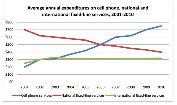
Top answer
The provided line graph illustrates plots / compares / shows / gives ("illustrate" means to make a picture. Use this verb for maps, flow charts and other diagrams. ) the average amount of money spent yearly on mobile phones, national and international landline phones in American (wrong word.
- The provided line graph illustrates plots / compares / shows / gives ("illustrate" means to make a picture.
- Use this verb for maps, flow charts and other diagrams.
- ) the average amount of money spent yearly on mobile phones, national and international landline phones in American (wrong word.
- ) over a the nine-year period.
- (You description is incomplete.
Get the Weekly English Kit 📬
New words, one handy idiom, and a 2-minute quiz — delivered to your inbox to keep your streak alive.
The provided line graph illustrates plots / compares / shows / gives ("illustrate" means to make a picture. Use this verb for maps, flow charts and other diagrams. ) the average amount of money spent yearly on mobile phones, national and international landline phones in American
 Related Questions