
Please Help Me By Evaluating My Essay. [Writing Task 1 Line chart]
The line graph shows the percentage of New Zealand population from 1950 to 2050.
The provided graph computes the percentage of the population in New Zealand from 1950 to today and the projection of it up to the year of 2050
Overall, majority of the population belongs to the oldest age group. This number is predicted to still be the highest in 2050. Besides, It can be obviously seen that while the population of people who aged between 0 - 14 and those of the age group 37 - 64 experience and upward trend, there is a fall in the percentage of people in the other two age groups over the given period of time.
Over the initial 40 years of the given period, the population of the elderly rose gradually and peaked at nearly 70% 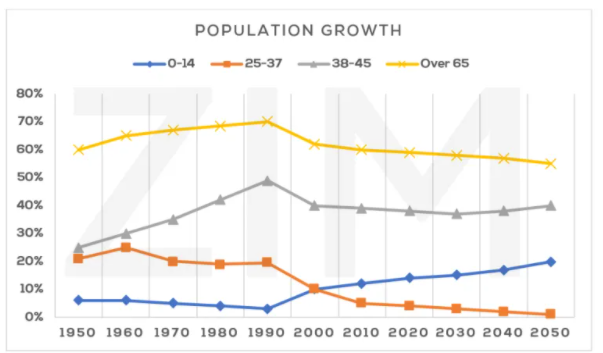
in 1990. A dramatic increase occurred in the percentage of people whose ages are between 37 - 64 during the same period of time. The percentages of the two youngest age groups was seen a mild drop and there was only 2% of New Zealand's population belonged to the the age group of 0 - 14 in 1990. Until today, the percentage of people whose ages are below 14 has been recovering and reaches approximately 15% in 2020 whereas there were steady downturns observed in the other three age groups where in 2020, the population of those who are 25 - 37, 38 - 45 and over 65 are about 4%, 40% and 55% respectively.
Until 2050, the demographic of those aged 14 and below is expected to continue rising steadily and account for about a fifth of the total population whereas the percentage of the oldest age group and the age group of 25 - 37 is predicted to fall gradually to just above 50% and 0% respectively. There is also a constant fall expected on the population of the age groups 38 - 64 to about 35% in 2030 and a steady recovery to nearly 40% 20 years later.
Top answer
Effio Dinh The provided graph computes the percentage of the population in New Zealand from 1950 to today and the projection of it up to the year of 2050 That is apparently not what this graph shows. Where did you find this piece of junk? It is entirely bogus.
- Effio Dinh The provided graph computes the percentage of the population in New Zealand from 1950 to today and the projection of it up to the year of 2050 That is apparently not what this graph shows.
- Where did you find this piece of junk?
- It is entirely bogus.
- Throw this kind of trash (the topic and the graph, not your writing) in the garbage bin.
- Use a legitimate practice test.
Get the Weekly English Kit 📬
New words, one handy idiom, and a 2-minute quiz — delivered to your inbox to keep your streak alive.
Effio DinhThe provided graph computes the percentage of the population in New Zealand from 1950 to today and the projection of it up to the year of 2050
That is apparently not what this graph shows. Where did you find this piece of junk? It is entirely bogus. Throw this kind of trash (the topic and the graph, not your writing) in the garbage bin.
Us
 Related Questions