
Please help me by checking this essay. Thank you so much.
Please help me by checking this essay. Thank you so much!!!
The chart below shows the amount of leisure time enjoyed by men and women of different employment status.
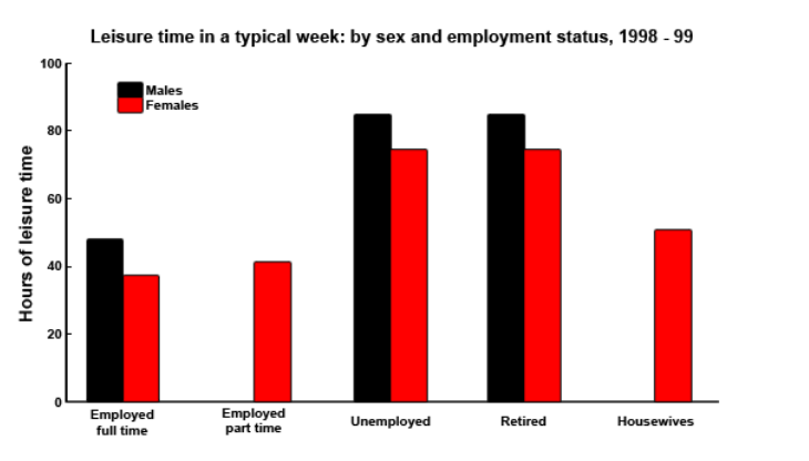
The bar chart compares the number of hours of leisure time people in five different employment statuses had in the period from 1998 to 1999 between two genders.
Overall, it is clear that in each labor status, males had more leisure time than female except for people employed part time and housewives. In these two categories, there was no statistic for males. Unemployed and retired people had the largest amount of time spent on leisure activities in both genders. Men in two employment statuses shared the same number of hours with 85 hours free per week. Similarly, the amount of leisure time of unemployed females was over 75 hours, the same as that of those in retirement.
Employed full-time men possessed approximately 50 hours for recreational activities per week, dominating over that of the opposite sex with only 37 hours. There was only statistics for females who were housewives or participated in part-time jobs, at 40 hours for the former and 50 hours for the latter.
Top answer
The bar chart compares the number of hours of leisure time people in five different employment statuses (awkward) had in the period from 1998 to 1999 between two genders. (poor English, incorrect) The chart is too complicated to be described in one sentence. For many Task 1 figures, you must write 2 or 3 sentences.
- The bar chart compares the number of hours of leisure time people in five different employment statuses (awkward) had in the period from 1998 to 1999 between two genders.
- (poor English, incorrect) The chart is too complicated to be described in one sentence.
- For many Task 1 figures, you must write 2 or 3 sentences.
- It also makes the body paragraphs much easier to write because you use words like "category" will will come in handy.
- Suggestion: The bar chart compares the number of hours of leisure time per week that men and women had in 1998-99, depending on their employment status.
Get the Weekly English Kit 📬
New words, one handy idiom, and a 2-minute quiz — delivered to your inbox to keep your streak alive.
The bar chart compares the number of hours of leisure time people in five different employment statuses (awkward) had in the period from 1998 to 1999 between two genders.(poor English, incorrect)
The chart is too complicated to be described in one sentence. For many Task 1
 Related Questions