
Please give me some feedback on my IELTS Writing Task 1. Thanks!
The charts below show the percentage of water used for different purposes in six areas of the world.
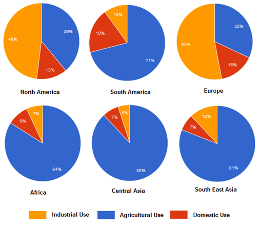
The six pie charts plot how much water is consumed in different sectors of six regions, namely North America, South America, Europe, Africa, Central Asia, and Southeast Asia. The three outputs shown are industry, agriculture, and domestic use.
Overall, while a majority of water is provided for the industry in North America and Europe, the other four areas utilize it mostly for agricultural activities.
The shares of total amount devoted to three sectors in North America and Europe are nearly the same, with the highest proportions of around a half in industry. Next comes agriculture, accounting for 39% and 32% respectively, and finally the remaining 15% each or below is for domestic purposes.
With respect to the other four regions, they concentrate water source into agriculture with more than 80% of the total (South America is around 10% lower). Of particular note is that domestic activities in South America have the largest consumption of water among the six areas, comprising roughly a fifth. Meanwhile, minimal percentages are allocated to industry and domestic use in Africa, Central Asia, and Southeast Asia, ranging from 12% to 19%.
Top answer
The six pie charts plot how much ( How much would be a number such as 39 million liters. g. ) the percentage of water is consumed by agriculture, industry and households in different sectors of six regions, namely North America, South America, Europe, Africa, Central Asia, and Southeast Asia.
- The six pie charts plot how much ( How much would be a number such as 39 million liters.
- g.
- ) the percentage of water is consumed by agriculture, industry and households in different sectors of six regions, namely North America, South America, Europe, Africa, Central Asia, and Southeast Asia.
- The three outputs shown are industry, agriculture, and domestic use.
- ) Example: The six pie charts compare the relative amounts of water used in three different economic sectors (Industry, Agriculture and Domestic use) among six regions of the world, four continents (Europe, Africa, North and South America) and two large areas of Asia (Central and South East).
Get the Weekly English Kit 📬
New words, one handy idiom, and a 2-minute quiz — delivered to your inbox to keep your streak alive.
The six pie charts plot how much (How much would be a number such as 39 million liters. e.g. How much water do you drink each day?) the percentage of water is consumed by agriculture, industry and households in different sectors of
 Related Questions