
Please give me some feedback on my IELTS Writing Task 1. Thanks!
The chart below shows global sales of the top five mobile phone brands between 2009 and 2013. Units sold (million)
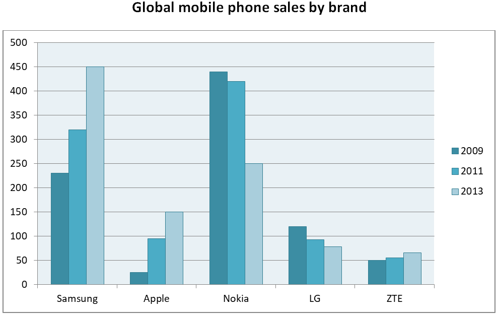
The bar chart compares the turnover from sales of five leading mobile phones corporations, namely Samsung, Apple, Nokia, LG and ZTE from 2019 to 2013.
Overall, Samsung and Nokia were two dominant brands throughout the period but showed completely opposite trends. Meanwhile, the other three brands were still unpopular, despite two of them showed upward trajectories.
In the initial year, Nokia rank first by selling around 440 million cell phones, with Samsung coming in second (roughly 230 million), followed by LG and ZTE (120 million and 50 million each) and finally Apple at about 25 million. The positions persisted over the next 2 years, except for Apple quadrupling and surpassing LG by a negligible number. Increases also occurred in global sales of Samsung and ZTE, while marginal falls of almost 20 million each in Nokia and LG were observed by 2011.
All five brands continued their trend lines until the final year. Samsung overtook Nokia to become the corporation with the highest turnover of mobile phones, at 450 million, doubling that of 2009. Nokia and LG decreased markedly to 250 million and 80 million, while Apple and ZTE reached 150 million and 70 million respectively in 2013.
Top answer
The units are missing from the chart. Did you copy it correctly? The bar chart compares the turnover (wrong word) from sales of five leading mobile phones (wrong form) corporations, namely Samsung, Apple, Nokia, LG and ZTE from 2019 to 2013 .
- The units are missing from the chart.
- Did you copy it correctly?
- The bar chart compares the turnover (wrong word) from sales of five leading mobile phones (wrong form) corporations, namely Samsung, Apple, Nokia, LG and ZTE from 2019 to 2013 .
- (incorrect.
- This is not continuous data over four years.
Get the Weekly English Kit 📬
New words, one handy idiom, and a 2-minute quiz — delivered to your inbox to keep your streak alive.
The units are missing from the chart. Did you copy it correctly?
The bar chart compares the turnover (wrong word) from sales of five leading mobile phones (wrong form) corporations, namely Samsung, Apple, Nokia, LG and ZTE from 2019 to 2
Here is a sample essay. Study the vocabulary for bar charts and compare it with vocabulary for line graphs.
Also, to get the highest score, you have to do some simple primary-school arithmetic, combining categories where it is logical.
The bar chart plots how many mobile phones were sold worldwide for the five top-selling global brands in 2009, 2011 and 2013. The companies a
 Related Questions