
Please give me feedback. Thank you!
My answer:
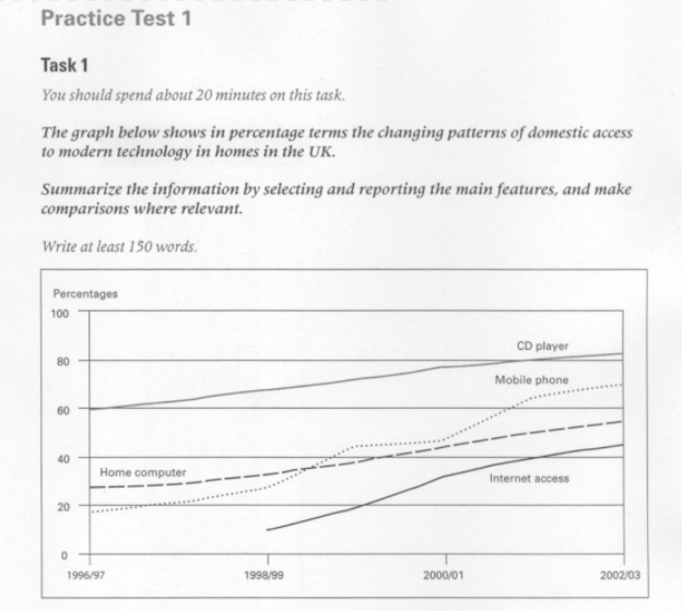
The line chart shows the trend in access to modern technology in ordinary British homes from 1996/97 to 2002/03.
As regards the first, CD player rose steadily from 60% in 1996/97 to more 80% at the end of the stage. The kind that tends to be similar was Home Computer which began with 25% and doubled in the late period. Likewise, there was a gradual soaring in the using of Mobile phone over the first two years, followed by a slower pace extends half of next year and 70% was picked up in 2002/03. The last pattern-Internet was not like these former that had appeared the first in 1998/99 and had always been below the others. Furthermore, it climbed stably ending the period at approximately 45%.
In conclusion, we can see that there is only an upward trend for all categories and have differences between these time points.
Thank you for your review!
Top answer
The line chart (There is no such thing as a line chart. ) shows the trend in access (Vague. Tell the reader what subjects are shown.
- The line chart (There is no such thing as a line chart.
- ) shows the trend in access (Vague.
- Tell the reader what subjects are shown.
- ) to modern technology in ordinary British homes from 1996/97 to 2002/03.
- ) CD player rose steadily from 60% in 1996/97 to more 80% at the end of the stage .
Get the Weekly English Kit 📬
New words, one handy idiom, and a 2-minute quiz — delivered to your inbox to keep your streak alive.
The line chart (There is no such thing as a line chart. There are Pie charts, bar charts, organization charts, Gantt charts, flow charts and eye charts, but sadly, no line charts.) shows the trend in access (Vague. Tell the reader what subjects are shown. - how many and what they are.) t
 Related Questions