
Please everyone check my essay for me. Thanks.
The pie chart shows the amount of money that a children's charity located in the USA spent and received in one year. Summarize the information by selecting and reporting the main features and make comparisons where relevant. Write at least 150 words
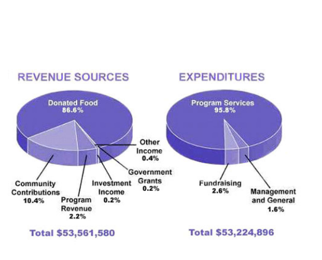
The pie charts present the percentage of revenue resources and expenditures of a children’s charity in the USA each year. Overall, donated food and program services were the most predominant.
Just over 85% of revenue resources for children’s charity went on donated food, with a 86.6% share. In second place was community contributions providing 10.6% of revenue for charity. Program revenue accounted for 2.2% of the total, when it was in third place. The percentage of investment income and Government grants stood at only 0.2% respectively. Finally, 0.4% of the total went on other income.
At the same time, program services made up the largest proportion of expenditures, dominating the other spending, with 95.8%. Whereas, 2.6% of all the categories was fundraising. On the other hand, only 1.6% of the total which was the smallest proportion of overall expenditures was management and general.
Top answer
The pie charts present the percentage of revenue resources (wrong word) and expenditures of a children’s charity in the USA each year . ) Overall, donated food and program services were the most predominant. 6% share.
- The pie charts present the percentage of revenue resources (wrong word) and expenditures of a children’s charity in the USA each year .
- ) Overall, donated food and program services were the most predominant.
- 6% share.
- (repetitious.
- 6 % of (missing word) revenue for charity .
Get the Weekly English Kit 📬
New words, one handy idiom, and a 2-minute quiz — delivered to your inbox to keep your streak alive.
The pie charts present the percentage of revenue resources (wrong word) and expenditures of a children’s charity in the USA each year. Each year means that there is more than one year.) Overall, donated food and program services were the most predo
 Related Questions