
Please evaluate my writing for IELTS Task 1
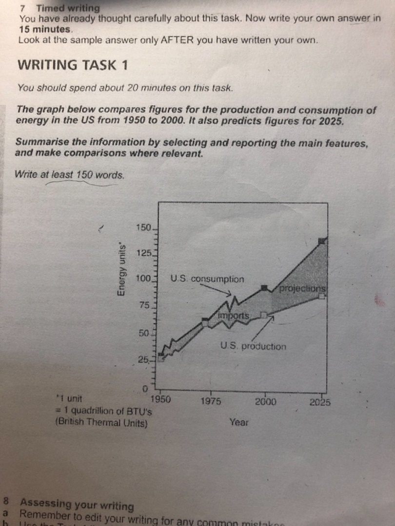
The line graph presents the rate of change between the energy production and consumption of the U.S from 1950 to 2000 as well as projected figures towards the year of 2025. Overall, the main pattern that can be observed is upward throughout the period.
Both figures had a starting point around 25 units and experienced a slight fluctuation in the first few years of the quarter. During this period, there was a similarity between the numerical statistics and the rate of change between the U.S consumption & production figures. Moving on to the next quarter, the U.S generated more energy but was still 30 units behind the actual consumption figure. Therefore, it had to import more energy compared to the previous 25 years. Lastly, it is estimated that in the first quarter of the 21st century, the U.S will be consuming up to 140 units while only producing 85 units of energy.
WRITE DESCRIPTION HERE
Top answer
The line graph presents the rate of change between (That means one single line on the graph. Is that what is on the graph? A rate is measured in units/time.
- The line graph presents the rate of change between (That means one single line on the graph.
- Is that what is on the graph?
- A rate is measured in units/time.
- S from 1950 to 2000 as well as projected figures towards (wrong word) the year of 2025.
- (Do not write about the data in paragraph #1.
Get the Weekly English Kit 📬
New words, one handy idiom, and a 2-minute quiz — delivered to your inbox to keep your streak alive.
The line graph presents the rate of change between (That means one single line on the graph. Is that what is on the graph? A rate is measured in units/time. For example, a rate of speed is 40 km/hour.) the energy production and consumption of the U.S from 1950 to 2000 as well as projected figures
 Related Questions