
Please evaluate my task 1 IELTS writing (Cam7-test2)
The graph below shows the consumption of fish and some different kinds of meat in a European country between 1979 and 2004.
Summarise the information by selecting and reporting the main features, and make comparisons where relevant.
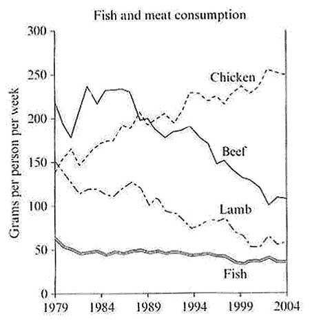
The line graph compares the amount of four different protein sources (beef, chicken, lamb and fish) consumed in a country in Europe over a period from 1979 to 2004.
Overall, chicken consumption increased and overtook as the most favored type of meat in this nation. In contrast, the figure for the other three types of ingredients decreased during the same period shown.
In 1979, beef was the most consumed among four categories of protein, which is almost 4 times as high as the consumption of fish (220 grams compared with 60 grams per person per week). The amount of chicken and lamb eaten was roughly tied at 150 grams per person per week in the same year.
From 1979 to 2004, the consumption of chicken rose sharply and reached a peak at 260 grams each person per week. By contrast, the number for beef reduced significantly to only 110 grams in the last year of the period. Likewise, there was a remarkable decline in the amount of lamb used from 150 grams to around 50 grams for each person weekly. The fish consumption was lowest and it also fell slightly by about 15 grams per person per week.
Top answer
The line graph compares the amount of four different protein sources (beef, chicken, lamb and fish) consumed, in grams per person per week, in a country in Europe over a the period from 1979 to 2004. Overall, chicken consumption increased and overtook the others as the most favored type of meat in this nation . In contrast, the figure for amounts of the other three types of ingredients (wrong word.
- The line graph compares the amount of four different protein sources (beef, chicken, lamb and fish) consumed, in grams per person per week, in a country in Europe over a the period from 1979 to 2004.
- Overall, chicken consumption increased and overtook the others as the most favored type of meat in this nation .
- In contrast, the figure for amounts of the other three types of ingredients (wrong word.
- ) decreased during the same period shown .
- In 1979, beef was the most consumed among the four categories of protein , which is almost 4 times as high as the consumption of fish (220 grams compared with 60 grams per person per week).
Get the Weekly English Kit 📬
New words, one handy idiom, and a 2-minute quiz — delivered to your inbox to keep your streak alive.
The line graph compares the amount of four different protein sources (beef, chicken, lamb and fish) consumed, in grams per person per week, in a country in Europe over a the period from 1979 to 2004.
Overall, chicken consumption increased and overtook the other
Sample essay
In Task 1, you get a lot of extra points for combining categories and making comparisons instead of just copying numbers from the graphic to your paragraphs. In this graph, there is an opportunity to compare the total amount of these protein sources that people ate at the beginning versus the end. Also, you can calculate the percentage of the total for some of the meats.
 Related Questions