
Please correct my writing task 1. Many thanks!
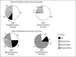
The pie charts below show units of electricity production by fuel source in Australia and France in 1980 and 2000. Summarize the information by selecting and reporting the main features, and make comparisons where relevant.
The four pie charts compare how many units of electricity were produced by five categories of fuel sources, coal, oil, natural gas, hydro power, and nuclear power in two nations Australia and France between 1980 and 2000.
Overall, while in Australia there were overwhelming amounts of electricity produced by coal compared with other sources, in France the total amount of nuclear power contributed the most in producing electricity.
In detail, in 1980 and 2000, totals for electricity production in Australia had a considerable increase, with coal accounted for 50 and 130 units; however, oil and natural gas went through serious declines and shared the same value of merely 2 units in 2000. It was a reverse trend in France, whilst nuclear power was the most favored fuel source in electricity production with a significant rise from only 15 units to 126 units, hydro and natural gas were least chosen fuel categories with totals of only 20 and 4 units respectively in two years. Additionally, there were stable data for the other two sources, coal and oil; it was a total of 50 units for coal, which was 5 units higher than that of oil, 45 units.
Top answer
I enclosed here another bigger image, thank you in advance, teacher!
- I enclosed here another bigger image, thank you in advance, teacher!
Get the Weekly English Kit 📬
New words, one handy idiom, and a 2-minute quiz — delivered to your inbox to keep your streak alive.
The four pie charts compare how many units of electricity were produced by five categories of fuel sources, coal, oil, natural gas, hydro power, and nuclear power in two nations Australia and France in between 1980 and 2000. ("Between" is not good. It means all the years 1980, 1981, 1982,... 1997, 1998, 1999, 2000. There are only two se
 Related Questions