
Please correct my writing task 1. Many thanks!
The chart below shows information about changes in average house prices in five different cities between 1990 and 2002 compared with the average house prices in 1989. Summarize the information by selecting and reporting the main features, and make comparisons where relevant.
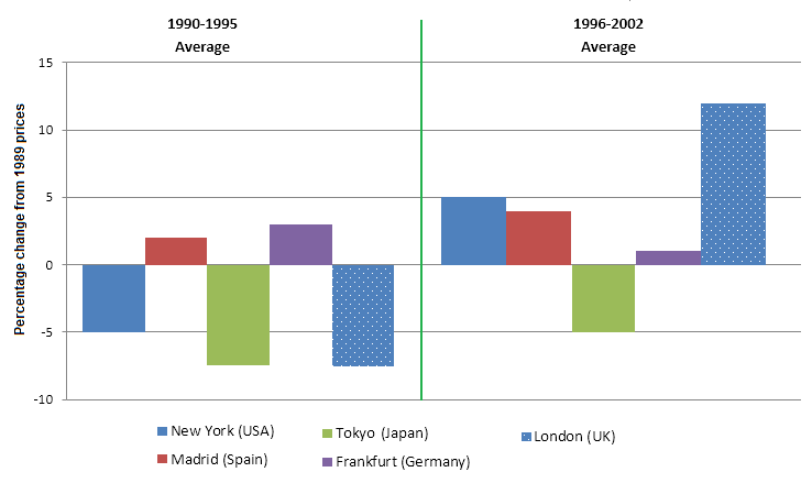
The bar chart plots the percentage of how average house prices changed in different cities namely, New York, Madrid, Tokyo, Frankfurt, and London between 1990 and 2002 in comparison to those in 1989.
In overall, the average costs of housing in the first period 1990-1995 were consistently low and even negative in amount compared with those in 1996-2002 when the values considerably climbed.
In detail, between 1990 and 1995, while the total costs of houses in three cities New York, Tokyo, and London were in negative directions with lows of -7.5% in Tokyo and London, and exactly -5% in New York, positive percentages were recorded in Frankfurt and Madrid with a slight edge between each, at nearly 2,5% and 2% respectively. On the contrary, there was a reverse for the data in the later period of 1996-2002; though proportions of prices in Tokyo still remained negatively low (-5%), there were significant increases in other cities, with London having the highest amount (12%), followed by New York (5%), and finally Frankfurt (2%) which was only 0.5% lower than itself in the first period.
Top answer
The bar chart plots the percentage of how average house prices changed in different cities namely, New York, Madrid, Tokyo, Frankfurt, and London between 1990 and 2002 (Incorrect. ) in comparison to those in 1989. The two bar charts (one for 1990-1995 and the second for 1996-2002) plots the percentage of changes in average house prices in five cities namely, New York, Madrid, Tokyo, Frankfurt, and London, as compared to 1989.
- The bar chart plots the percentage of how average house prices changed in different cities namely, New York, Madrid, Tokyo, Frankfurt, and London between 1990 and 2002 (Incorrect.
- ) in comparison to those in 1989.
- The two bar charts (one for 1990-1995 and the second for 1996-2002) plots the percentage of changes in average house prices in five cities namely, New York, Madrid, Tokyo, Frankfurt, and London, as compared to 1989.
- In overall, the average costs of housing in the first period 1990-1995 (The reader is confused.
- You wrote that there was one period, 1990-2002.
Get the Weekly English Kit 📬
New words, one handy idiom, and a 2-minute quiz — delivered to your inbox to keep your streak alive.
The bar chart plots the percentage of how average house prices changed in different cities namely, New York, Madrid, Tokyo, Frankfurt, and London between 1990 and 2002 (Incorrect. The averages are not for this twelve-year period.) in comparison to those in 1989.
The two bar charts (one for 1990-1995 and t
Sample essay:
The bar chart compares percentage changes in house prices in five different cities: New York, Madrid, Tokyo, Frankfurt and London. Prices are averaged over two time periods, 1990-1995 and 1996-2002 and compared to a baseline, the average in 1989.
Overall, in the first period, the average house price had dropped in three of these cities: New York, Toky
 Related Questions