
Please correct my writing task 1. Many thanks!
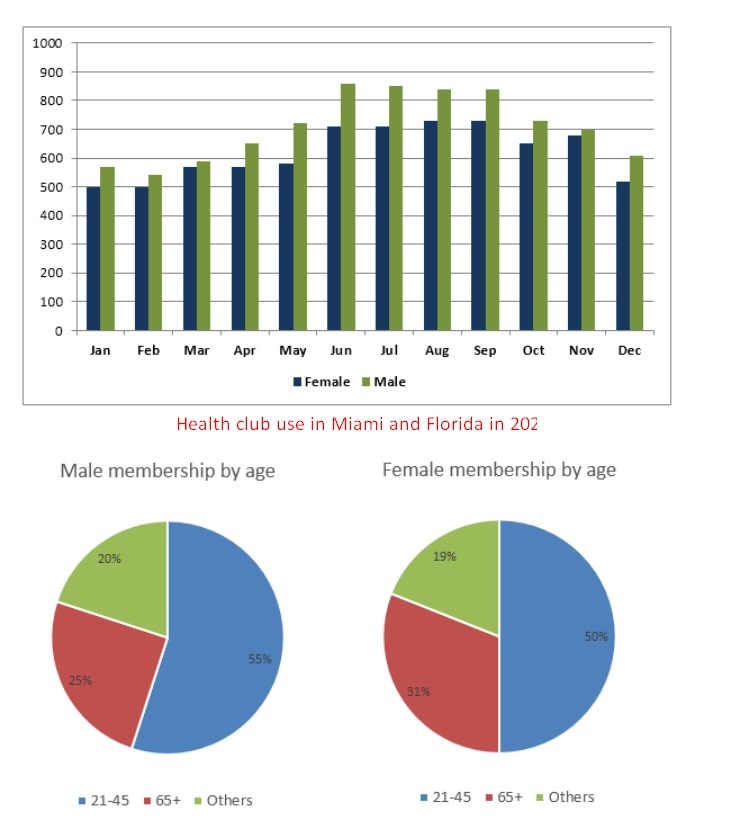
The graph below shows average monthly use of a health club in Miami and Florida by all full time members in 2017. The pie chart shows the age profile of male and female members of this club. Summarize the information by selecting and reporting the main features, and make comparisons where relevant.
The bar graph depicts the use of full-time male and female memberships of a health club located in Miami in 2017. The two pie charts compare percentages of those members belonging to several age groups, 21-45, older than 65, and others.
Overall, the total monthly use of women was lower than that of men. Moreover, those who are 21-41 clearly had the largest percentages compared with other age ranges.
In detail, regarding the bar graph, between January and June, both men and women share the similar trend, there were exactly 500 women going to the club in the first two months while the number of men was 50 higher, at 550; it then climbed slightly and peaked at 870 men as opposed to 700 women. From July to December, there were dramatic declines in both genders, the values for women reached a peak of 720 in August and September, but later decreased to 520 which were 100 lower than those of men in the final year.
With regard to the pie charts, men and women in the age groups of 21-45 had overwhelming proportions, at 55% and 50% respectively; it was followed by seniors, summed at 56% of both men and women, which were 17% higher than those of other brackets, at 39% in total.
Top answer
The bar graph depicts the use of full-time male and female memberships ( Use of memberships makes no sense at all. What are these people using? ) of a health club located in Miami in 2017.
- The bar graph depicts the use of full-time male and female memberships ( Use of memberships makes no sense at all.
- What are these people using?
- ) of a health club located in Miami in 2017.
- The two pie charts compare percentages of those members belonging to several in three age groups, 21-45, older than 65, and others.
- Overall, the total monthly use of women (Oh dear.
Get the Weekly English Kit 📬
New words, one handy idiom, and a 2-minute quiz — delivered to your inbox to keep your streak alive.
The bar graph depicts the use of full-time male and female memberships (Use of memberships makes no sense at all. What are these people using? ) of a health club located in Miami in 2017. The two pie charts compare percentages of those members belonging to several in three age gro
Sample essay:
The bar chart plots the monthly attendance numbers for men and women at a health club in Miami, Florida in 2017. The two pie charts give the age distribution of the male and female members in three age brackets, adults (21-45), seniors (65 and older) and all others.
Overall, more men than women attended in every month. But the curves for men and women were highly cor
 Related Questions