
Please correct my IELTS Writing Task 1
The charts below show the average percentages in typical meals of three types of nutrients, all of which may be unhealthy if eating too much.
Summaries the information by selecting and reporting the main features, and make comparisons where relevant.
Write at least 150 words.
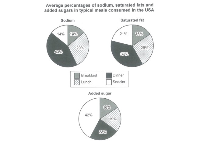
The pie charts compare the average proportions of three unhealthy nutrients, namely sodium, saturated fat and added sugar, in typical meals consumed by American people.
Overall, while the majority of sodium and saturated fats are consumed in dinner, added sugars are mostly eaten in snack. In addition, breakfast is by far the healthiest meal during the day.
The average percentages of sodium and saturated fats consumption in dinner are the highest, (43% and 37% respectively). Both are followed by those of lunch, with 29% for sodium and 26% for saturated fat. However, there are just 23% of add sugar consumed through eating dinner and nearly one-fifth through eating lunch.
In terms of breakfast, more or less 15% of those nutrients is eaten during it. Regarding snacks, its average percentage for added sugar constitutes up to 42%, while those for sodium and saturated fat are barely 14% and 21% accordingly.
Please correct it. Many thanks!
Top answer
) consumed by American people. (Your first paragraph is incomplete. ) Model opening paragraph.
- ) consumed by American people.
- (Your first paragraph is incomplete.
- ) Model opening paragraph.
- 1.
- Tell the reader the type and the number of charts and what each chart has in it: Three pie charts, labelled sodium, saturated fat, and added sugar, 2.
Get the Weekly English Kit 📬
New words, one handy idiom, and a 2-minute quiz — delivered to your inbox to keep your streak alive.
The pie charts (How many pie charts?) compare the average proportions of three unhealthy nutrients, namely sodium, saturated fat and added sugar, in typical meals (What are the meals?) consumed by American people. (Your first paragraph is incomplete. You need to give all aspects of the figure, but do not write about the data.)
Model opening paragraph.
 Related Questions