
Please check this.
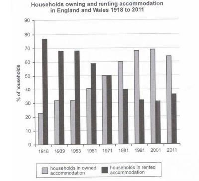
The chart below shows the percentage of households in owned and rented accommodation in England and Wales between 1918 and 2011.
The bar chart compares the proportion of owned and rented English and Welsh accommodation over the 1918–2011 period.
Overall, the percentage of households in owned accommodation witnessed a considerable increase, while the data for rented houses showed the opposite trend. In addition, there was a change in the positions of the two categories at the end of the period.
In 1918, nearly 80% of households were in rented housing. Meanwhile, a much lower figure of over 20% was recorded for the owned accommodation, which was about a third of the value of the remaining category. In the following years, household ownership increased gradually while rentals decreased steadily, thus narrowing the gap between them. In 1971, the proportion of the two categories became even at 50%.
From 1981 to 2001, the owned accommodation kept increasing and then reached a peak of nearly 70% in 2001 before declining slightly to roughly 65% in 2011. On the other hand, rented houses continued to fall, reaching a low of around 30% in 2001 before rising marginally to around 35% in the final year.
Top answer
The bar chart compares the proportion of owned and rented English and Welsh accommodation in England and Wales over the 1918–2011 period. Overall, the percentage of households in owned accommodation witnessed a considerable increase, while the data for rented houses showed the opposite trend. In addition, there was a change in the positions of the two categories at the end of the period .
- The bar chart compares the proportion of owned and rented English and Welsh accommodation in England and Wales over the 1918–2011 period.
- Overall, the percentage of households in owned accommodation witnessed a considerable increase, while the data for rented houses showed the opposite trend.
- In addition, there was a change in the positions of the two categories at the end of the period .
- In 1918, nearly 80% of households were in rented housing.
- Meanwhile, a much lower figure of over 20% was recorded for th os e in owned accommodation.
Get the Weekly English Kit 📬
New words, one handy idiom, and a 2-minute quiz — delivered to your inbox to keep your streak alive.
The bar chart compares the proportion of owned and rented English and Welsh accommodation in England and Wales over the 1918–2011 period.
Overall, the percentage of households in owned accommodation witnessed a considerable increase, while the data for rented houses showed the opposite trend. In addition, there was a chan
 Related Questions