
Please check: Task 1 essay
In June 1996, an experimental flu vaccine was trialled in a large country town on females only. The result of this survey is presented in the following illustration.
Summarise the information by selecting and reporting the main features, and make comparisons where relevant.
»You should write at least 150 words.
Presented are three graphs which illustrate the effects of an experimental vaccine given to women in a large country town in June 1996.
Overall, it is clearly evident that the mortality from flu dramatically increased, while the incidence rate of flu slightly decreased post-vaccination. Furthermore, the most affected group among those who received the vaccine were those aged 65 years old and over.
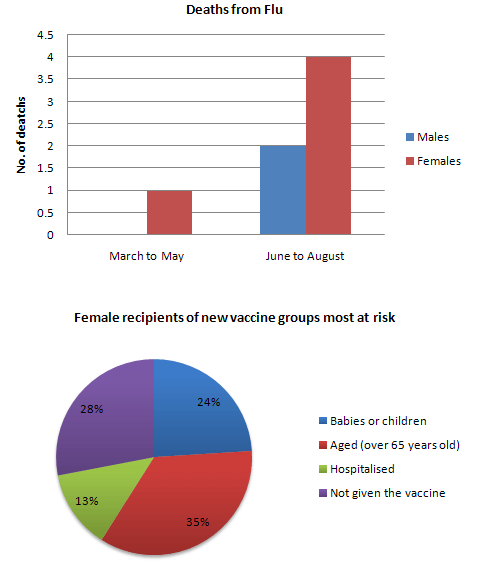
Initially, the deaths from flu were negligible for both sexes from March to May of 1996. After the trial vaccine was given to women, the mortality from flu rose with women being affected the most with 4 deaths. It can also be observed that old people were most at risk followed by those who did not receive the vaccine and babies or children. Paradoxically, people who were hospitalized were the least group at risk.
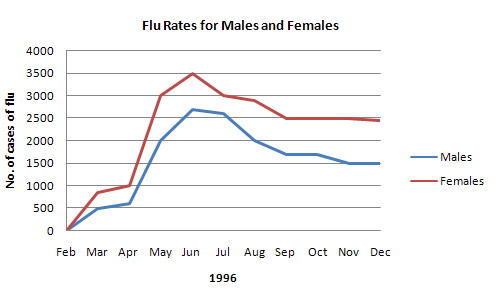
On the other hand, the number of people in both genders inflicted with flu modestly declined after the flu vaccine was given among women. At the start of the period, there were zero cases of flu. After which, the cases of flu for both gender significantly increased to peak at 3500 in females and just over 2500 in males in June. From this point, the incidence of flu declined in both men and women, with 1500 and 2500 cases in the final year, respectively
Top answer
Where does it say when the vaccine was administered?
- Where does it say when the vaccine was administered?
Get the Weekly English Kit 📬
New words, one handy idiom, and a 2-minute quiz — delivered to your inbox to keep your streak alive.
Some of these diagrams are quite odd. For instance, in the first bar chart we have 'number of deaths', but the scale shows '0.5' and '1.5': what does half a death mean?
Secondly, why do more females die than males, if the females received the vaccine? Are we supposed to conclude that the vaccine made the situation worse?
Thirdly, the label for the pie chart seems nonsensical. How c
 Related Questions