
Please check my writing task 1. Thank you so much
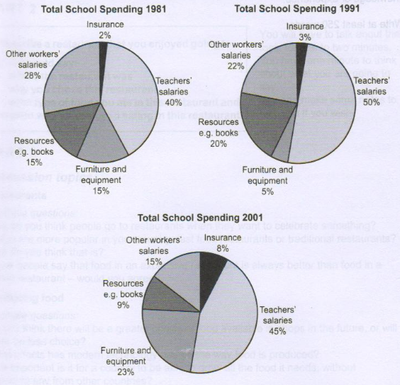
The three pie charts below show the changes in annual spending by a particular UK school in 1981, 1991 and 2001.
Summarise the information by selecting and reporting the main features, and make comparisons where relevant.
The three pie charts compare the yearly expenditure in five categories in 3 separate years, 1981, 1991, and 2001, respectively.
Overall, teacher's salaries remained the largest cost while insurance contributed the least to total spending over the mentioned period. There were downward trends in spending on other workers' salaries and on resources while expenditure on insurance and furniture and equipment increase sharply.
In detail, teachers' salaries initially accounted for 40% of expenditure, thence increased by 10% in 1991 before witnessing a light decrease to 45% at the end of the period, was the biggest segment. Meanwhile, insurance proportion in 2001 increased quadruple to 8% in comparison with the proportion in 1981, but it still was the smallest part of the chart. The percentage of money spent on furniture and equipment decreased by 10% between 1981 and 1991 but soared to 23% at the end of the period.
In contrast, although spending on resources such as books had a slight growth of 5% from 1981 to 1991, it witnessed a dramatical drop in 2001, at 9%. Payment for other workers also decreased gradually by almost 7% every 10 years.
Top answer
Please post essays, paragraphs, dialogues and other writing in the essay forum so a moderator does not have to move your post. htm
- Please post essays, paragraphs, dialogues and other writing in the essay forum so a moderator does not have to move your post.
- htm
Get the Weekly English Kit 📬
New words, one handy idiom, and a 2-minute quiz — delivered to your inbox to keep your streak alive.
Please post essays, paragraphs, dialogues and other writing in the essay forum so a moderator does not have to move your post.
https://www.englishforums.com/English/EssayReportCompositionWriting/Forum9.htm
The three pie charts compare the yearly expenditure of one school in the UK in five categories in 3 three separate years, 1981, 1991, and 2001, respectively. (incorrect usage. Also, when there are three separate years, it is not a "period" A period is a range of time on a line graph,
The three pie charts illustrate the changes in annual spending by a particular UK school in 1981, 1991 and 2001.
Overall, it is visible that spending on Insurance is highest increased and in contrast other workers salary. There were resources, furniture and equipment and teachers’ salaries fluctuated.
First of all, in 1981 total school’s highest spending on teachers’ salaries which
 Related Questions