
Please check my writing task 1
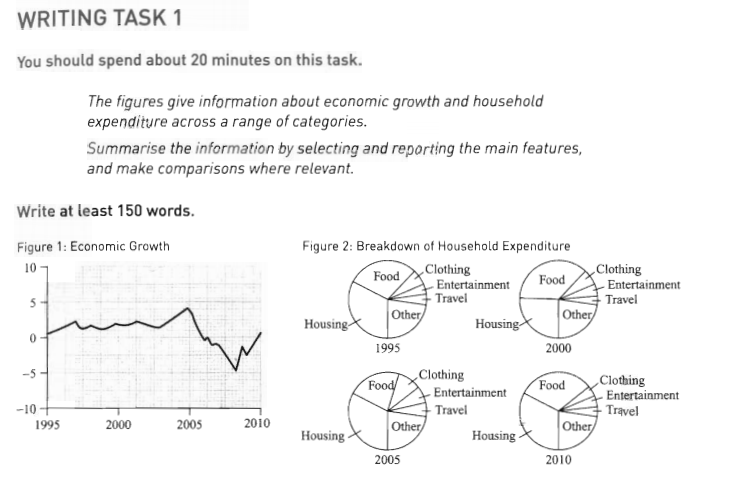
The line graph shows the growth of economic from 1995 to 2010 while the pie charts illustrate the consumption of household in many different sectors at the same period of time. Seen together, there appears to be a relationship between economic expansion and household consumption in various categories.
According to the line graph, the economic growth stood at 1 in 1995. After that, the figure fluctuated widely until 2003 before reaching a peak at nearly 5 in the next two years. Conversely, the expansion of economic decreased dramatically until hit the lowest point of -5 in the year 2008. And then, it rose significantly again at nearly 1 in two years later.
The consumption of households showed a similar pattern with economic growth. When the economy extended, household spending also appeared to increase in demands, which is irrelative to basic needs as clothing, entertainment and travel, account for a quarter of total consumption. However, when the economy decreased in size, the spending of unessential needs as food and housing accounted for a larger proportion of total consumption.
P/s: If you think some words or sentences should be changed, please make suggestions to help me improve my writing skill.
Top answer
The line graph shows the growth of [ 1] economic some country’s economy from 1995 to 201 0, while the pie charts illustrate the consumption of changes in household expenditure in many on six different sectors at the during that same period of time. Seen together, there appears to be no obvious relationship between economic expansion and household spending on consumption in various categories. According to the line graph, the e conomic growth stood at around 1 % in 1995.
- The line graph shows the growth of [ 1] economic some country’s economy from 1995 to 201 0, while the pie charts illustrate the consumption of changes in household expenditure in many on six different sectors at the during that same period of time.
- Seen together, there appears to be no obvious relationship between economic expansion and household spending on consumption in various categories.
- According to the line graph, the e conomic growth stood at around 1 % in 1995.
- After that, the figure fluctuated widely a little within a narrow range until about 2003, when it started rising before reaching and reached a peak at nearly 5 % in the next two years later .
- Conversely, the expansion of After that, economic growth decreased dramatically until it hit the lowest point of -5 (negative growth) in the year 2008.
Get the Weekly English Kit 📬
New words, one handy idiom, and a 2-minute quiz — delivered to your inbox to keep your streak alive.
The line graph shows the growth of [ 1] economic some country’s economy from 1995 to 2010, while the pie charts illustrate the consumption of changes in household expenditure in many
 Related Questions