
Please check my Task 1 IELTS
Topic:
The chart below shows numbers of incidents and injuries per 100 million passenger miles travelled (PMT) by transportation type in 2002.
Summarise the information by selecting and reporting the main features and make comparisons where relevant.
My essay:
The chart illustrates information about the percentage of incidents and injuries happened by the accidents when traveling by various transports in 2002.
Overall, the proportion of incidents was always higher than that of injuries in all means of transportations. Moreover, the demand response which was types of the vehicle had the largest accident data, while an opposite pattern can be seen from the commuter rail.
To be specific, both incidents and injuries which occurred in the commuter rail had nearly the same number, with approximately 0.23%. The second big figures were heavy rail, with the number of incidents and injuries were 0.5% and about 0.3%, respectively.
Although the light rail and bus had the same figures for incidents, at 0.75%, the proportion of injuries was smaller, with about 0.3% and 0.6%, respectively. By contrast, the demand response happened the most frequently accidents, with just over 2.5% incidents and about 1,7% injuries.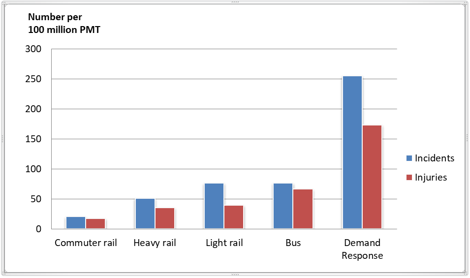
Top answer
) chart illustrates (poor word choice) information about (incorrect) the percentage (The units are not percentages. They are counts. Be careful to study the chart and use the correct units.
- ) chart illustrates (poor word choice) information about (incorrect) the percentage (The units are not percentages.
- They are counts.
- Be careful to study the chart and use the correct units.
- ) of incidents and injuries happened by the accidents when traveling by various (how many?
- ) transports in 2002.
Get the Weekly English Kit 📬
New words, one handy idiom, and a 2-minute quiz — delivered to your inbox to keep your streak alive.
The (What kind of chart?) chart illustrates (poor word choice) information about (incorrect) the percentage (The units are not percentages. They are counts. Be careful to study the chart and use the correct units. ) of incidents and injuries happened by the
 Related Questions