
Please check my task 1 essay. Thank you! (Line graph)
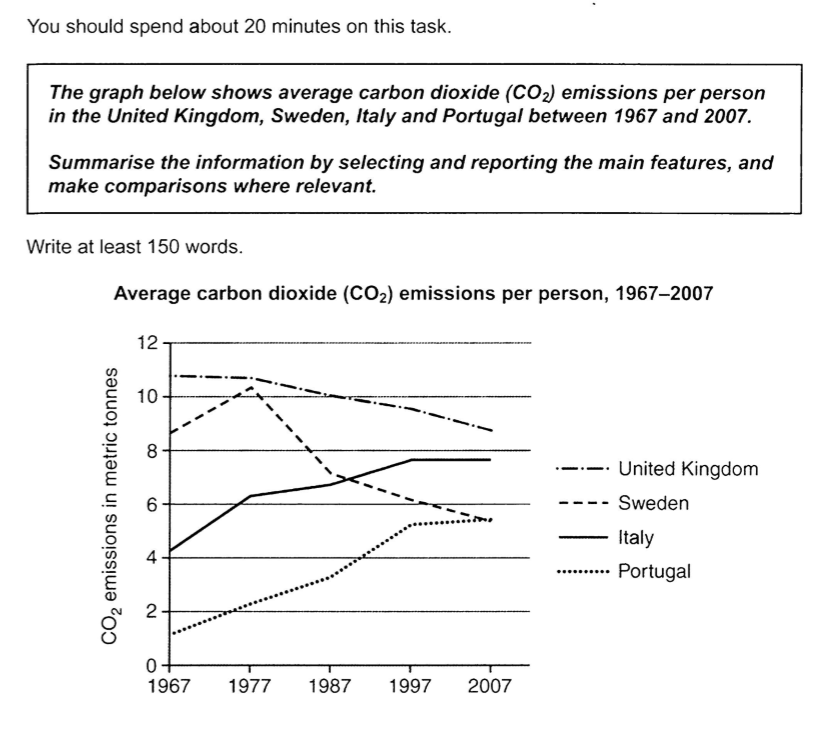
The line graph plots the average amount of carbon dioxide emitted per person (in metric tonnes) in five different countries, namely: the United Kingdom, Sweden, Italy, and Portugal over a forty-year period.
Overall, the greatest proportion of carbon dioxide was produced by British people, though it gradually decreased throughout the period. There was a downward trend in Sweden, as opposed to Italy and Portugal.
In 1967, nearly 11 metric tonnes of this greenhouse gas were from the United Kingdom, compared to 9 metric tonnes of those in Sweden, which increased by more than one metric ton a decade later. In 1987, this number for Sweden fell sharply by 3 metric tonnes and continued to decline throughout the period. A similar pattern is seen in the UK. By 2007, an individual produced an average of 9 metric tonnes and around 5 metric tonnes of CO2 in the UK and Sweden, respectively.
Italy's emission quantity was just over 4 tonnes, which was threefold the number of Portugal. The amount of CO2 emitted in both countries steadily increased and reached nearly 8 tonnes in Italy and 5 tonnes in Portugal by 1997 before remaining constant until 2007.
I tried to arrange my essay more logically this time. are my comparisons good enough? Please let me know. How can I improve my choice of words and structure?
Get the Weekly English Kit 📬
New words, one handy idiom, and a 2-minute quiz — delivered to your inbox to keep your streak alive.
 Related Questions