
PLEASE CHECK MY IELTS WRITING TASK 1. THANK YOU.
Topic:
The pie charts below give data on the spending and consumption of resources by countries of the world and how the population is distributed.
Summarize the information by selecting and reporting the main features, and make comparisons where relevant.
Essay:
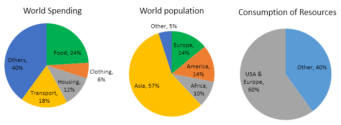
The given pie chart illustrates the expenditure and uses of resources by different nations and the population of various continents.
It is clear that Asia has the biggest population in the world. In addition, the USA and Europe use the most resources and a large amount of money is spent on others.
In detail, people spend two-fifths of their money on others, followed by 24% on food. 18% of expenditure is on transport, which is 6% higher than on housing. Meanwhile, only a trivial percentage of spending is on clothing, accounting for 6%.
Although the populations of Europe and America are equal and make up 28% of the world population, the USA and Europe consume the most resources, at 60%. By contrast, other continents use only 40% of the world's resources even though Asia is the most populous continent, taking up 57%, Africa and other continents constitute 10% and 5% respectively of the world population.
Top answer
soomi2209 The given pie chart illustrates the expenditure and uses of resources by different nations and the population of various continents. Is there one pie chart with this picture on it? Illustration / illustrate is for pictures.
- soomi2209 The given pie chart illustrates the expenditure and uses of resources by different nations and the population of various continents.
- Is there one pie chart with this picture on it?
- Illustration / illustrate is for pictures.
Get the Weekly English Kit 📬
New words, one handy idiom, and a 2-minute quiz — delivered to your inbox to keep your streak alive.
soomi2209The given pie chart illustrates the expenditure and uses of resources by different nations and the population of various continents.
Is there one pie chart with this picture on it?
Illustration / illustrate is for pictures.
 Related Questions