
Please check my ielts writing task 1 (cam9-test3) and evaluate its band score
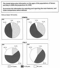
The pie charts compare the population of three age groups in Yemen and Italy in 2000 and how it is expected to change in 2050.
In general, in 2000, the group of people aged under 15 years was highest in Yemen while the highest figure in Italy was held by those from 15 to 59 years old. It is also noticeable that the proportion of elderly is expected to rise in both nations in the next 50 years.
From 2000 to 2050, a growth of 11 percent in the ratio of people in the 15 – 50 age group in Yemen. The opposite trend can be seen when we look at the percentage of the same age group in Italy, it is anticipated to decrease by one third over the period of 50 years.
Turning to the remaining sections, there is an anticipation that the proportion of the 0 – 14 age group in Yemen and Italy will drop by around 13 and 3 percent, respectively. On the contrary, the share of those aged 60 years and older is likely to double in the Italian population in 2050. The proportion of the oldest group in Yemen is projected to rise slightly over 50 years.
(203 words)
Top answer
Sorry, I cannot read that tiny diagram at all.
- Sorry, I cannot read that tiny diagram at all.
Get the Weekly English Kit 📬
New words, one handy idiom, and a 2-minute quiz — delivered to your inbox to keep your streak alive.
The (How many??) pie charts compare the population of three age groups, children younger than 15, adults 15-59, and the seniors over 60, in Yemen and Italy in 2000 and how it is expected to change in 2050. (What are the three age groups? For cohesion and coherence in your essay, describe the categories when you first describe the figure. R
 Related Questions