
Please check my ielts writing task 1
Topic: The three pie charts below show the changes in annual spending by a particular UK school in 1981, 1991 and 2001.
Summarize the information by selecting and reporting the main features and make comparisons where relevant.
------------------------------------------------------------------------------
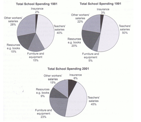
The pie charts compare the annual expenditure of a British school in terms of insurance, teacher’s salaries, furniture and equipment, resources and other workers’ salaries at three different points in time: 1981, 1991 and 2001.
It is clear that the amount of money paid for teachers accounted for almost half of the school spending while the spending on insurance was reported the least in each year.
In 1981, about 40% of the school’s budget was recorded as teachers’ salaries. This figure increased by 10% in 1991 and then dropped to 45% in 2001. Similarly, the proportion of salaries of non-teacher workers decreased steadily from 28% of the total expenses in 1981 to 15% in 2001.
Insurance made up the least in the school’s expenditure, at 2% in 1981 but gradually increased in 2001, reaching 8% of the total spending. Finally, the percentage of spending on resources and furniture/equipment varied significantly in each year. The figure for furniture/equipment was about 15% in 1981 and rose to 23% in 2001 after falling by 10% in 1991. The spending on resources such as books increased by 5%, from 15% in 1981 to 20% in 1991 but then dropped by roughly 10% in 2001.
Top answer
" The pie charts compare the proportions of annual expenditures of a British school on in terms of insurance, teacher’s salaries, furniture and equipment, resources and other workers’ salaries at three different points in time: 1981, 1991 and 2001. It is clear that T he amount of money paid for teachers accounted for almost half of the school spending while the spending on insurance was reported the least in each year. Expenditures for salaries were a major budgetary category, ranging from sixty to seventy-two percent in the years depicted.
- " The pie charts compare the proportions of annual expenditures of a British school on in terms of insurance, teacher’s salaries, furniture and equipment, resources and other workers’ salaries at three different points in time: 1981, 1991 and 2001.
- It is clear that T he amount of money paid for teachers accounted for almost half of the school spending while the spending on insurance was reported the least in each year.
- Expenditures for salaries were a major budgetary category, ranging from sixty to seventy-two percent in the years depicted.
- In 1981, about 40% of the school’s budget was devoted to recorded as teachers’ salaries.
- This figure increased by 10% in 1991 and then dropped to 45% in 2001.
Get the Weekly English Kit 📬
New words, one handy idiom, and a 2-minute quiz — delivered to your inbox to keep your streak alive.
Very good, but learn to use pronouns effectively and avoid the use of "figure."
The pie charts compare the proportions of annual expenditures of a British school on in terms of insurance, teacher’s salaries, furniture and equipment, resources and other workers’ salaries at three different poi
 Related Questions