
Please check my IELTS Task 1 Report.
Please check my report if you have time. Thank you in advance.
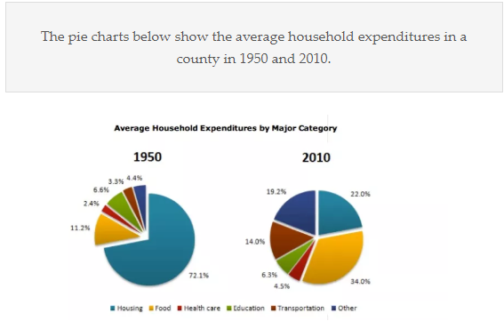
The pie chart compares the proportion of household spending on 6 different categories ( housing, food, health care, education, transportation, and other categories) in a county between 1950 and 2010.
Overall, the proportion of expenditure on housing and food were the highest in both years. In addition, the most dramatic changes were seen in the percentage for housing and food, while the proportion for the other 4 categories changed slightly over the period.
In 1950, household expenditure on housing ( 72.1%) was considerably higher than other categories, which decreased remarkably to 22% in 2010. In contrast, the proportion for food was only 11.2% in 1950, which roughly tripled to 34% over the period.
On the other hand, household spending on transportation and other categories were only 3.3% and 4.4% in 1950, increasing to 14% and 19.2% in 2010, respectively. In addition, the proportion for healthcare experienced a slight increase of 2% between the two years, while spending on education was almost unchanged.
Top answer
The pie chart shows a comparison of compares the proportion of household spending on 6 different categories ( housing, food, health care, education, transportation, and other categories) in a n unidentified county between two years sixty years apart: 1950 and 2010. Overall, the proportion (subject) of expenditure on housing and food were (verb. ) the highest in both years.
- The pie chart shows a comparison of compares the proportion of household spending on 6 different categories ( housing, food, health care, education, transportation, and other categories) in a n unidentified county between two years sixty years apart: 1950 and 2010.
- Overall, the proportion (subject) of expenditure on housing and food were (verb.
- ) the highest in both years.
- In addition, the most dramatic changes were seen in the percentage for housing and food, while the proportion for the other four categories changed only slightly over the period.
- ) than other categories, which decreased remarkably (Did the categories decrease?
Get the Weekly English Kit 📬
New words, one handy idiom, and a 2-minute quiz — delivered to your inbox to keep your streak alive.
The pie chart shows a comparison of compares the proportion of household spending on 6 different categories ( housing, food, health care, education, transportation, and other categories) in an unidentified county between two years sixty years apart: 1950 and 2010.
Overall, the propo
 Related Questions