
Please check my essay. Thank you.
The chart below gives information about how people aged 25-34 are housed in the UK.
Summarise the information by selecting and reporting on the main features, and make comparison were relevant.
My essay:
The bar chart shows the proportion of American people aged between 25 to 34 who were either house renters or buyers over an eleven-years period.
Overall, it is clear that the number of home owners have de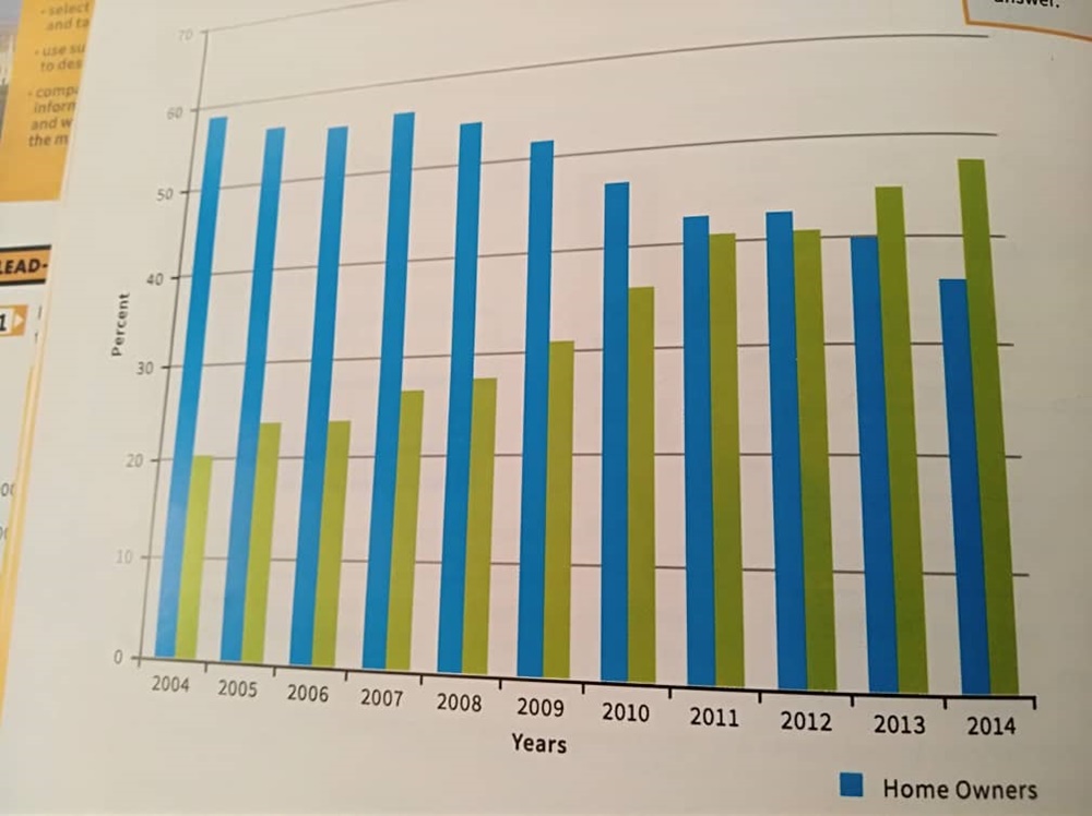
creased substantially over this period, while renters increased around the same amount. Throughout this time, the percentage of groups was always less than 60.
The number of people who bought a house, have declined from near 60% in 2004 to over 35% in 2014. The biggest decline has started since 2009 at just a little over 50 percent. Just in 2011 and 2012, this trend remained stable. In the same period, the proportion of people who rent a house, have increased from just a little above 20% in 2004 to under 50% in 2014. It has a steady increase.
Between 2004 and 2010, the number of home owners are much less than renters. After that, until 2012, this difference reduced to less than 5%. 2011 and 2012 have are similar and the renter’s and owner’s proportion were stable in these two years. After these years, the rental market overtook buyer’s market, more than 10% in 2014.
Top answer
) over an eleven-years (wrong form) period. (Incomplete paragraph. ) Overall, it is clear that (Unnecessary verbiage.
- ) over an eleven-years (wrong form) period.
- (Incomplete paragraph.
- ) Overall, it is clear that (Unnecessary verbiage.
- ) the number of home owners have (wrong form) decreased substantially over this period, while renters increased around the same amount.
- Throughout this time, the percentage of groups (wrong expression) was always less than 60 .
Get the Weekly English Kit 📬
New words, one handy idiom, and a 2-minute quiz — delivered to your inbox to keep your streak alive.
The bar chart shows the proportion of American (wrong word) people aged between 25 to 34 who were either house renters or buyers (wrong word - The chart does not show purchases.) over an eleven-years (wrong form) period. (Incomplet
 Related Questions