
Please check my essay.
The bar chart shows the literacy rate by region and gender in 2011.
Summaries the information by selecting and reporting the main features, and make comparisons where relevant.
Write at least 150 words.
My essay:
The shown chart is a graph of different region's literacy rate for both men and women in 2011 (green for men and violet for women).
The maximum rate belongs to Central Asia/Eastern Europe that is almost 100%. That means all people in these areas can read and write. Sub-Saharan Africa has the minimum rate. In comparison, the proportion of Sub-Saharan's literates to those of the largest rates is about four to ten, for women. and the difference in male literacy rate is just a third in these regions.
In four other areas, there is a difference between the number of literate women and men. The highest variance is in South and West Asia where 80% of men and about 60% of women can read and write. In these regions, there are three literate women for four littered men.
In general, in most areas, women's literacy percentage is less than that of men. 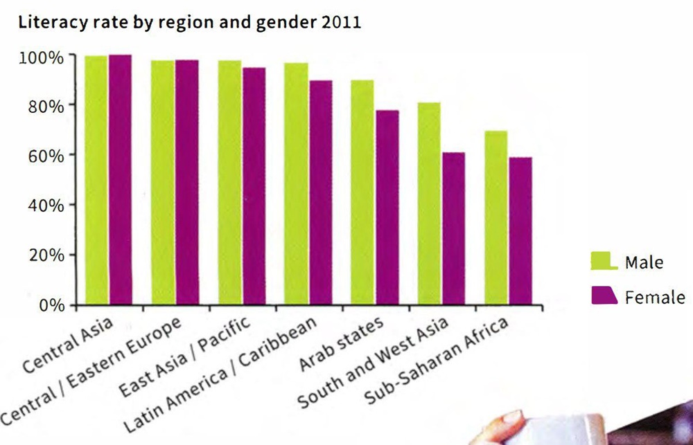
Top answer
) of different region's (wrong form) literacy rate for both men and women in 2011 (green for men and violet for women). ) The maximum rate belongs to Central Asia/Eastern Europe that is almost 100%. (People in Central Asia and Central/Eastern Europe have the highest rates, nearly 100% That means all people in these areas can read and write.
- ) of different region's (wrong form) literacy rate for both men and women in 2011 (green for men and violet for women).
- ) The maximum rate belongs to Central Asia/Eastern Europe that is almost 100%.
- (People in Central Asia and Central/Eastern Europe have the highest rates, nearly 100% That means all people in these areas can read and write.
- Sub-Saharan Africa has the lowest minimum rate.
- (The minimum is zero.
Get the Weekly English Kit 📬
New words, one handy idiom, and a 2-minute quiz — delivered to your inbox to keep your streak alive.
The shown chart is a graph (Learn the names of the figures that you will encounter in this task: line graph, bar chart, and pie chart.) of different region's (wrong form) literacy rate for both men and women in 2011 (green for men
 Related Questions