
Please check for my ielts writing task 1
Topic:
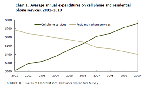
The graph below shows US consumers' average annual expenditures on cell phone and residential phone services between 2001 and 2010.
Write a report for a university, lecturer describing the information shown below.
Summarise the information by selecting and reporting the main features and make comparisons where relevant.
You should write at least 150 words.
My essay:
This line graph analyses annual consumptions on cell phone and household phone averagely in US from 2001 to 2010.
About cell phone services marked with the green line the use of this type increased gradually from the point of $200 at the begin year in 2001 and developed toward up-trend line optimistically until 2010 - the end point of the period researched. The finish year of the graph is also the peak point which reveals the customers on cell phone is up to approximately $700 and a half $100
Residential phone services are seen easily with the decrease trend in the period of 10 years (2001-2010). The year that is assessed as the highest number of consumption on homely phone is 2001 with the average total useage about nearly $700.
The opposite trend on 2 lines marked with 2 different colours emphasizes the growth well on phone market toward the developed cell phone trend. The use of cell phone is highly at the point of $700 in 2010 instead of slightly higher $400 of the residential phone services in the exactly same year.
To conclude, the expenditures on cell phone in US is up to higher $700 meaning that the technology of the country basically has been developing too. This is a good hint predictably about the future of cell phone's world still more and more grown
Top answer
trang1112 This line graph analyses annual consumptions on cell phone and household phone averagely in US from 2001 to 2010. The wrong words are highlighted. Here is a natural English description.
- trang1112 This line graph analyses annual consumptions on cell phone and household phone averagely in US from 2001 to 2010.
- The wrong words are highlighted.
- Here is a natural English description.
- The line graph compares the average outlay, in dollars, of US consumers for two types of telephone service, cellular and fixed line (residential), between 2001 and 2010.
- Consumption is non-count.
Get the Weekly English Kit 📬
New words, one handy idiom, and a 2-minute quiz — delivered to your inbox to keep your streak alive.
trang1112This line graph analyses annual consumptions on cell phone and household phone averagely in US from 2001 to 2010.
T
 Related Questions