
Please check for me this essay. Thank you!
Question:
The diagrams show total global population between 1900 and 2000, and its proportions according to region.
Essay:
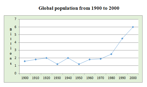
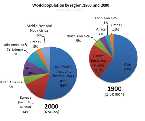
The line graph gives information about the population worldwide from 1900 to 2000. The pie charts show the percentages of the global population by region during the same period.
Overall, the trend for the world population is mostly upwards. Asia accounts for the largest proportion of the population, and Europe stands at the second place.
Starting from 1,5 billion in the year 1900, the global population is volatile until 1950. Since then, it increases significantly, finishing the period at 6 billion people, which is nearly six-time higher than the figure for 1950.
Most people settle in Asia, which accounts for 60% of the total world population. Europe (including Russia) comes as second place, 25%. However, both saw a sharp decline in 2000 to 54% and 14% respectively.
By contrast, Africa increases more than doubled from 4% to 10% in the year 2000. The same goes for Latin America & Caribbean, starting the period at 3% and ending it at 8%. Other and North America remain stable at 3% and 5% respectively. Besides, there is a coming of a new region called Middle East and North Africa that holds 6% of the world population at the end of the period.
Top answer
The line graph gives information about (What kind of information does it give? )) the population worldwide from 1900 to 2000. ) pie charts show the percentages of the global population by region during the same period.
- The line graph gives information about (What kind of information does it give?
- )) the population worldwide from 1900 to 2000.
- ) pie charts show the percentages of the global population by region during the same period.
- (incorrect.
- It does not show 1913, 1926 or 1942 or 1977 or many other years.
Get the Weekly English Kit 📬
New words, one handy idiom, and a 2-minute quiz — delivered to your inbox to keep your streak alive.
The line graph gives information about (What kind of information does it give? What is on the graph?)) the population worldwide from 1900 to 2000. The (How many pie charts?) pie charts show the percentages of the global population by region during the same period. (incorrect. It does
 Related Questions