
Please Advise Me On IELTS Writing Task 1. Thanks in advance.
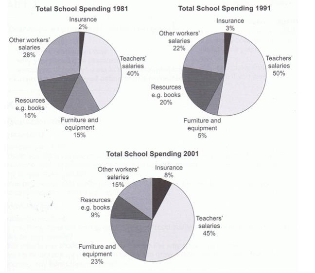
The pie charts compare the percentage of overall expenditure of a school in the years 1981, 1991 and 2001.
It is clear that the school by far spent the most money on teachers’ salaries over the whole 20-year period. By contrast, insurance was the smallest cost in all three years.
A detailed look reveals that teachers’ salaries had the largest major, almost a half of total spending in 1981 and 2001, and sharply 50% in 1991. Meanwhile, the amount money of resources and furniture and equipment spending fluctuated moderately. Eventually, the total amount of money of these two categories accounted for around 30%.
Despite occupying to the smallest proportion of total school spending throughout 20 years, there was a slightly upward trend in insurance, which rose to 8% in 2001. Whereas, having the second biggest proportion of spending in 1981, the amount of money spending other workers’ salaries saw a considerable decline to 22% and 15% in 1991 and 2001 respectively.
Top answer
The pie charts compare the percentage of overall expenditures of a school in the years 1981, 1991 and 2001 for five categories. It is clear that the school by far spent the most money on teachers’ salaries over the whole 20-year period. By contrast, insurance was the smallest cost in all three years.
- The pie charts compare the percentage of overall expenditures of a school in the years 1981, 1991 and 2001 for five categories.
- It is clear that the school by far spent the most money on teachers’ salaries over the whole 20-year period.
- By contrast, insurance was the smallest cost in all three years.
- A detailed look reveals that teachers’ salaries had the largest major , almost a half of total spending in 1981 and 2001, and sharply 50% in 1991.
- Meanwhile, the amount money of resources and furniture and equipment spending fluctuated moderately.
Get the Weekly English Kit 📬
New words, one handy idiom, and a 2-minute quiz — delivered to your inbox to keep your streak alive.
The pie charts compare the percentage of overall expenditures of a school in the years 1981, 1991 and 2001 for five categories.
It is clear that the school by far spent the most money on teachers’ salaries over the whole 20-year period. By contrast, insurance was the smallest cost in all three years.
A detailed look reveals that teachers’ salaries had the largest
 Related Questions